#possibly photoshop haha
Explore tagged Tumblr posts
Text
Gates McFadden & the Violin
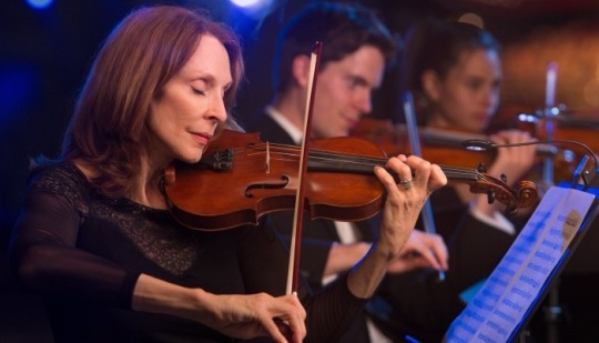
source: gatesplays.com (dead link) - photoshoot for website (x)
#gates mcfadden#and son!#type: photograph#type: misc#year: 2015#photoshoot#possibly photoshop haha#beverly crusher#star trek#dr crusher#star trek: the next generation#type: event#media: misc#source: gatesplays.com (dead link)
21 notes
·
View notes
Text
My GIF Making process: Screen capturing using MPV player, Organizing files, 3 Sharpening settings, Basic Coloring PSD + Actions set

This is a very long post so heads up.
I’ll try to be as thorough and true as much as possible to the way I make my gifs (I already use Photoshop Actions which I’ve long since set up but now for this tutorial I’m reviewing them to show you the exact steps I’ve learned to create my gifs 😃) and present them to you in a semi-coherent way. Also, please bear with me since English is my second language.
First things first. Below are the things and tools we need to do this:
Downloaded 4K or 1080p quality videos (let’s all assume we know where to get these—especially for high definition movies and tv series—so this post doesn’t get removed, okay? 😛)
Adobe Photoshop CC or the CS versions can work as well, but full disclosure I haven’t created gifs using the CS versions since 2020. I’m currently using Adobe Photoshop 2024.
mpv player. Use mpv player to get those frames/screenshots or any other video player that has a screen grabber feature. I’ve used adapter for the longest time but I’ve switched to mpv because the press to screenshot feature while the video is playing has been a game changer not to mention ultimate time saver for me. For adapter you need to play it in another video player (like VLC player), to get the start and end timestamps of the scene you want to gif which takes me ages before I can even open Photoshop.
Anyway! Please stop reading this post for a moment and head over to this amazing tutorial by kylos. She perfectly tells you how to install and use mpv player, both for Mac and Windows users.
One thing I have to share though, I had a tough time when I updated my MacOS to Sonoma since MPV is suddenly either duplicating frames or when I delete the duplicates the player seems to be skipping frames :/ I searched and found a solution here, though it didn’t work for me lol. My workaround for this in the meantime is decreasing the speed down to 0.70 then start screenshotting—it’s not the same pre Sonoma update but it works so I’ll have to accept it rather than have jumpy looking gifs.
Now, after this part of kylos’ tutorial:

you can continue reading the following sections of my gif tutorial below.
I want to share this little tip (sorry, this will only cater to Mac users) that I hope will be helpful for organizing the screenshots that MPV saved to the folder you have selected. Because believe me you don’t want to go through 1k+ of screenshots to select just 42-50 frames for your gif.
The Control + Command + N shortcut
This shortcut allows you to create a new folder from files you have pre-selected. As you can see below I have already created a couple of folders, and inside each folder I have selected screenshots that I want to include in one single gif. It's up to you how you want to divide yours, assuming you intend to create and post a Tumblr gifset rather than just one gif.

Another tip is making use of tags. Most of, if not all the time, I make supercorp gifs so I tag blue for Kara and red (or green) for Lena—just being ridiculously on brand and all that.
Before we finally open Photoshop, there's one more thing I want to say—I know, please bear with me for the third? fourth? time 😅
It's helpful to organize everything into their respective folders so you know the total number of items/frames you have. This way, you can add or delete excess or unnecessary shots before uploading them in Photoshop.
For example below there are 80 screenshots of Kara inside this folder and for a 1:1 (540 x 540 px) Tumblr gif, Photoshop can just work around with 42-50 max number of frames with color adjustments applied before it exceeds the 10 MB file size limit of Tumblr.

Sometimes I skip this step because it can be exhausting (haha) and include everything so I can decide visually which frames to keep later on. You'll understand what I mean later on. But it's important to keep the Tumblr 10 MB file size limit in mind. Fewer frames, or just the right amount of frames, is better.
So, with the screenshot organization out of the way, let's finally head over to Photoshop.
Giffing in Photoshop, yay!
Let’s begin by navigating to File > Scripts > Load Files into Stack…

The Load Layers window will appear. Click the Browse button next.
Find your chosen screenshots folder, press Command + A to select all files from that folder then click Open. Then click OK.
After importing and stacking your files, Photoshop should display the following view:

By the way, I'll be providing the clip I've used in this tutorial so if want to use them to follow along be my guest :)
If you haven't already opened your Timeline panel, navigate to Windows > Timeline.
Now, let's focus on the Timeline panel for the next couple of steps.
Click Create Video Timeline, then you’ll have this:

Now click the menu icon on the top right corner then go to Convert Frames > Make Frames from Clips

Still working on the Timeline panel, click the bottom left icon this time—the icon with the three tiny boxes—to Convert to Frame Animation
Select Make Frames From Layers from the top right corner menu button.
So now you have this:

Go and click the top right menu icon again to Select All Frames
Then click the small dropdown icon to set another value for Frame Delay. Select Other…

The best for me and for most is 0.05 but you can always play around and see what you think works for you.
Click the top right menu icon again to Reverse Frames.
I think Photoshop has long since fixed this issue but usually the first animation frame is empty so I just delete it but now going through all these steps there seems to be none of that but anyways, the delete icon is the last one among the line of feature buttons at the bottom part of the Timeline panel.
Yay, now we can have our first proper GIF preview of a thirsty Lena 😜

Press spacebar to watch your gif play for the very first time! After an hour and half of selecting and cutting off screenshots! 😛 Play it some more. No really, I’m serious. I do this so even as early (lol) as this part in the gif making process, I can see which frames I can/should delete to be within the 10 MB file size limit. You can also do it at the end of course 🙂
Now, let’s go to the next important steps of this tutorial post which I’ve numbered below.
Crop and resize to meet Tumblr's required dimensions. The width value should be either 540px, 268px, or 177px.
Convert the gif to a Smart Object for sharpening.
Apply lighting and basic color adjustments before the heavy coloring. I will be sharing the base adjustments layers I use for my gifs 😃.
1. Crop and Resize
Click on the Crop tool (shortcut: the C key)

I like my GIFs big so I always set this to 1:1 ratio if the scene allows it. Press the Enter key after selecting the area of the frame that you want to keep.
Side note: If you find that after cropping, you want to adjust the image to the left or another direction, simply unselect the Delete Cropped Pixels option. This way, you will still have the whole frame area available to crop again as needed and as you prefer.
Now we need to resize our gif and the shortcut for that is Command + Opt + I. Type in 540 as the width measurement, then the height will automatically change to follow the ratio you’ve set while cropping.
540 x 540 px for 1:1
540 x 405 px for 4:3
540 x 304 px for 16:9
For the Resample value I prefer Bilinear—but you can always select the other options to see what you like best.
Click OK. Then Command + 0 and Command + - to properly view the those 540 pixels.

Now we get to the exciting part :) the sharpen settings!
2. Sharpen
First we need to have all these layers “compressed” intro a single smart object from which we can apply filters to.
Select this little button on the the bottom left corner of the Timeline panel.


Select > All Layers
Then go to Filter > Convert for Smart Filters
Just click OK when a pop-up shows up.
Now you should have this view on the Layers panel:

Now I have 3 sharpen settings to share but I’ll have download links to the Action packs at the end of this long ass tutorial so if you want to skip ahead, feel free to do so.
Sharpen v1
Go to Filter > Sharpen > Smart Sharpen…
Below are my settings. I don’t adjust anything under Shadows/Highlights.
Amount: 500
Radius: 0.4
Click OK then do another Smart Sharpen but this time with the below adjustments.
Amount: 12
Radius: 10.0

As you can see Lena’s beautiful eyes are “popping out” now with these filters applied. Click OK.
Now we need to Convert to Frame Animation. Follow the steps below.
Click on the menu icon at the top right corner of the Timeline panel, then click Convert Frames > Flatten Frames into Clips
Then Convert Frames > Convert to Frame Animation
One more click to Make Frames From Layers
Delete the first frame then Select All then Set Frame Delay to 0.05

and there you have it! Play your GIF and make sure it’s just around 42-50 frames. This is the time to select and delete.
To preview and save your GIF go to File > Export > Save for Web (Legacy)…
Below are my Export settings. Make sure to have the file size around 9.2 MB to 9.4 MB max and not exactly 10 MB.

This time I got away with 55 frames but this is because I haven’t applied lighting and color adjustments yet and not to mention the smart sharpen settings aren't to heavy so let’s take that into consideration.
Sharpen v1 preview:

Sharpen v2
Go back to this part of the tutorial and apply the v2 settings.

Smart Sharpen 1:
Amount: 500
Radius: 0.3
Smart Sharpen 2:
Amount: 20
Radius: 0.5
We’re adding a new type of Filter which is Reduce Noise (Filter > Noise > Reduce Noise...) with the below settings.

Then one last Smart Sharpen:
Amount: 500
Radius: 0.3
Your Layers panel should look like this:

Then do the Convert to Frames Animation section again and see below preview.
Sharpen v2 preview:

Sharpen v3:
Smart Sharpen 1:
Amount: 500
Radius: 0.4
Smart Sharpen 2:
Amount: 12
Radius: 10.0
Reduce Noise:
Strength: 5
Preserve Details: 50%
Reduce Color Noise: 0%
Sharpen Details: 50%
Sharpen v3 preview:

And here they are next to each other with coloring applied:
v1

v2

v3

Congratulations, you've made it to the end of the post 😂
As promised, here is the download link to all the files I used in this tutorial which include:
supercorp 2.05 Crossfire clip
3 PSD files with sharpen settings and basic coloring PSD
Actions set
As always, if you're feeling generous here's my Ko-fi link :) Thank you guys and I hope this tutorial will help you and make you love gif making.
P.S. In the next post I'll be sharing more references I found helpful especially with coloring. I just have to search and gather them all.
-Jill
#tutorial#gif tutorial#photoshop tutorial#gif making#sharpening#sharpening tutorial#photoshop#photoshop resources#psd#psd coloring#gif coloring#supercorp#supercorpedit#lena luthor#supergirl#my tutorial#this has been a long time coming#guys. i'm BEGGING you. use the actions set - it was a pain doing all this manually again ngl LMAO#i've been so used to just playing the actions#so this has been a wild refresher course for me too 😆
477 notes
·
View notes
Note
Hi! Can you write Mk mans x Pokémon trainer reader?
Basically reset somehow got into Earthrealm with not way back to their world and Liu Kang decided to kick them as one of his champions since he saw a potential in them. And when reader explains their world they like “Well yeah we have a Pokémon that possibly can destroy world” and “once I battled against god and mafia when I was ten haha”
──★ ˙ ̟ Random Mk1 men x GN! Pokemon trainer reader
Note: Im so sorry that this took so long to come out my mental health kinda took a nose dive with my creativity and i didn’t want to half ass this so that’s why this ended up being so short I apologise

「 ✦ Havik ✦ 」
* Lets start with just a random man Havik: he LOVES you and your little creatures
* Immediately asks which one is strongest
*Has tried teaching your pokemon about the way of living in chaos and freedom (basically indoctrinated them into his belief)
* Havik absolutely adores hearing stories of your realm, like you mean when you were 10 years old you took down a mafia gang, competed in a tournament and battled with a gang. ALL OF THAT and your fighters these little things. He’s impressed and entertained for hours
* Havik’s favourites are poison, ghost and rock type pokemon

「 ✦ Johnny Cage ✦ 」
* ,, Can i make a movie about these little guys please 🥺“
* Buys them clothes, accessories and dresses them up, they’re like little plushies to him
* Haa definitely bought custom glasses with the first letter of they’re names for all your little friends
* He posts pictures about your pokemon on insta even tough you said to explicitly NOT do it (he just tells people its photoshop
* When you tell him stories of all the wacky stuff that you see in your world he desperately want to go to the point he begs Liu kang to send him to your universe

「 ✦ Liu Kang ✦ 」
* He takes care of timelines and also now your pokemon
* Because he is the god of fire Liu Kang radiates a lot of warmth so when he meditates all your palls lay down next, on or near him
* Liu kang spoils the crap out of your pokemon to the point where they are absolutely attached to him following him all the time, annoying him and and some just bite his legs a sign of love but also attachment
* Ok this ones obvious bcuz hes a fire god he tends to like fire type and dragon type pokemon
* Looks at you with the most concerned expression possible while your just happily smiling and telling stories about how you fought off a mafia
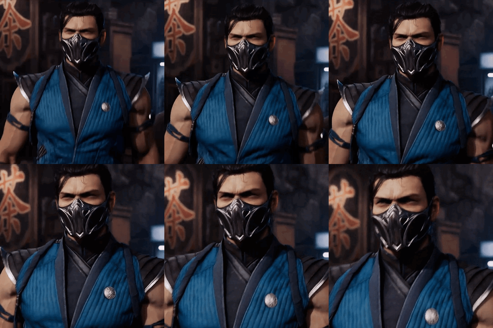
「 ✦ Bi-han ✦ 」
* Goes withouth saying that fighting, ice and flying type pokemon are most interesting to Bihan
* Bihan learns the hard way that you can’t train pokemon like little soldiers and you teach him how to properly train them
* If you and Bihan ever manage to return to your universe he’ll look at you with proud eyes when you win battles
* Tries to apply the same strategy you use when in combat to his own fights or training sessions for the Lin Kuei soldiers
* Don’t even try to explain how certain types are categorised or how some pokemon can defeat other with the most random luck because he’ll just end up with a headache
*. ੈ✩‧₊˚༺☆༻*ੈ✩‧₊˚
#mk1#mortal kombat#mortal kombat x reader#mortal kombat 1 x reader#mortal kombat 1#mortal kombat x gn reader#havik#mk havik#johnny cage#liu kang#bihan#sub zero#havik x reader#johnny cage x reader#liu kang x reader#bihan x reader#subzero x reader#i tried my best still not my proudests work#also ive been watching a shit ton of supernatural so thats that#back to school on monday
186 notes
·
View notes
Text
Happy Chrysler! The brushes and fonts are here!
After months of promising I've finally put together the ULTIMATE LO DEBAUCHERY brush and font pack! This was something I've been wanting to put together and release for a while but between technical difficulties, moving PC's, and wanting to ensure the brush pack was as refined as possible, it led to some delays. That said, it's finally finished!
VERSION 3 HERE! Helpful anon struck back not once, but twice! This will be the FINAL RELEASE of this brush pack (unless anything else is discovered but at this point it's feeling pretty complete! Any new additions will be collected and released in a new version at a later date <3)
WHAT'S INCLUDED:
All the brushes I consistently use in my panel edits of LO and Rekindled panels, among a metric FUCKTON of others provided by the community since releasing the first build! All the brush files are .abr meaning they can be used cross-platform between Clip Studio, Photoshop, Procreate, and other compatible drawing software!
A small selection of fonts from the Jason Brubaker 26 Fonts set.
A raw .clip and .psd file of Persephone from Episode 38 containing all the layer information for you to pull apart and play with! Also comes with an instruction layer to explain what brushes were used and where. Please use responsibly ( ´ ∀ `)ノ~ ♡
An .mp4 time lapse of an Eros panel recreation from S1 using the newest set of brushes!
WHAT'S NOT INCLUDED:
Clip Studio brushes that I also use due to exporting limitations. This includes the standard Gouache brush (which I've replaced with some Photoshop-compatible brushes that are close enough) and the Design Pencil brush, both of which come pre-packaged as default brushes with Clip Studio Paint. So if you use CSP, you should be able to find these missing brushes in your default brush kits!
The remaining 23 fonts from the Jason Brubaker set as they're not typically used in LO and I don't want to go releasing an entire font pack. Note that you should NOT use the provided fonts commercially unless you've legally paid for them. If you want all of his comic fonts to use royalty-free then you can buy them on Gumroad!
The canvas texture overlay that I apply to all my pages, the one I use can be found in Clip Studio's default texture overlays but you can undoubtedly also find overlays for free online or simply use the "Add Canvas" brush that's included in the brush pack! (the overlay is just faster and more uniform haha)
Commercial ownership - these brushes are all being provided to use for free, but you are NOT allowed to use these commercially, says the law. If you try to use these in a professional commercial product and get caught, it's your own funeral! Use at your own risk!
A lot of research and trial and error went into putting this together, so I'm thrilled to finally bring it to y'all for your panel editing, text editing, and style-studying needs ~ Consider this my grand gesture of appreciation and gratitude for accepting me into this community with open arms and showing so much support for what I've added to the table <3 Enjoy! ( ´ ∀ `)ノ~ ♡
And if anyone asks you where or how you got these, no you didn't-

#merry crismus#happy chrysler#many of these brushes are adapted from other brush kits that have been made inaccessible by corporations like adobe#so be cool about it mkay#resource sharing is caring#that said i'm turning off reblogs so pls stick to message / link sharing okie poke#lore olympus critical#anti lore olympus#lo critical
191 notes
·
View notes
Note
hi lovely!! do you have any tips on making cool fun and sexy typography?
hey joanna!! this made me giggle haha, i'm not quiiiite sure how to answer that, but here are some tips i keep in my when i do typography, and some examples:
FONTS
don't be afraid to "shop" for fonts and try funky fonts you've never used/seen. i often try so many before settling. i almost always use at least 2 different font for gifsets, even 3 sometimes. i think a good font pairing can do a lot for a gif. it's usually something like:
serif + cursive/funky fonts (example)
sans serif + cursive/funky fonts (example)
serif + sans serif fonts (example)
two different cursive/funky fonts (example)
or even simply the same font but all caps + all lowercase (example)
in case you're unsure where too start or want inspiration, here's a great resource: usergif's font pairing guide and its fonts page
BLEND MODES & LAYER STYLES
i think playing around with different blend modes and layer styles will always elevate your typography game, in my opinion. it's usually a bit more dynamic than just an opaque color. tho this minimalist typography can also be really good.
when you double click on a text layer, you get all the layer style options, as well as the blend modes. a very popular layer style is setting the layer's blending option to difference, paired with a color and/or gradient overlay (often set to multiply/color dodge). a drop shadow is also important so the text is more easily readable. we often see a black soft drop shadow, but don't hesitate to be creative with it, for example a thick, hard line, colorful drop shadow.
i feel like this step often takes the most time for me because the possibilities are endless. definitely play around with layer styles, especially drop shadow, color overlay, gradient overlay, stroke. and also try different blending modes for these settings.
as for the layer's blend mode, also definitely play around with them. and keep in mind that the text's color will also give a different result, it doesn't have to be white + blend mode set to difference, even tho this is a classic that works well.
TEXT WRAPING & POSITION
a great feature on photoshop is definitely the text warping tool. to access it, right click on a text layer and go "warp text". from there you'll get a few different styles and setting sliders. my favorites are flag and wave (example). you can always go back to edit these settings once they're done by right clicking again. and you can even keyframe/animate these settings!
typography doesn't always have to be centered and straight, i often prefer it on a side and rotated a little. you can easily rotate typography by selecting the layer(s) and hitting ctrl + T. you can also play with the skew and pespective after hitting ctrl + T by right clicking the canvas and clicking on either. these will give different ways to move your text.
SIZING
i love playing around with different font sizes, it makes the typography more interesting in my opinion, and it's a way to emphasize some words.
so for that reason i usually put each word on a different layer so i can edit each word separately. sometimes i will also put each letter on a different layer, because it can be interesting to offset/rotate some letters sometimes (example) (another example).
i often pair a quite small serif or sans serif font with a much bigger funky font (example). and often that bigger font will also have different sized words (example). i play around a lot with this!
ADDED EFFECTS
there are some things than can be done to enhance typography:
adding a colorful rectangle block behind the text (example)
using text symbols such as quotation marks or backets (example)
using lines around the text (example) (another example)
these can definitely bring typography to a different level
MORE RESOURCES
great font website
usergif's typography tag
my fonts tag
this is all i can think of right now, i hope it helps :D if you have any question on a specific text effect let me know, i can definitely make a tutorial!
#alie replies#silversmists#typography#photoshop#*ps help#resource#completeresources#allresources#resourcemarket#usercats#userabs#userpjo
214 notes
·
View notes
Text
my natal chart & heterochromia theory
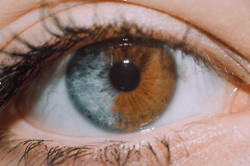
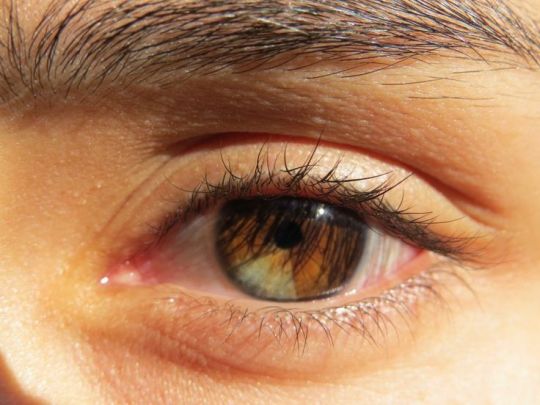
firstly, I would like to emphasize that this is only a hypothesis of mine and it needs a lot more evidence to support it.
despite heterochromia being a rare phenomenon, I happen to know two people who have it - my mother and my best friend. both of them have Sagittarius Sun, but I think this is just a coincidence. because of this, I became interested in some patterns that could potentially indicate different eye colors.
it's also important to note that here I consider cases of full or partial coloration as "heterochromia". I don't include situations where people have slightly noticeable tone differences or perhaps color veins. also here I'm speaking about genetic heterochromia, not acquired one.
there are many different approaches to the question of identifying the significator of the eyes in astrology. some people say that the Sun represents the right eye for men and the Moon represents the left eye, while the opposite is true for women. some people mention Saturn and Venus.
however, I have a different theory.
in medical astrology the head and eyes in particular are associated with Aries. therefore, I believe that we need to deal with Mars. I also consider the Sun, as its exaltation is in Aries as well.
to summarize. according to my hypothesis, we have Aries, Mars, and the Sun responsible for the eyes.
next, we need to identify the possible reasons of "corruption". my assumption is as follows:
1. Chiron, as it refers to oxymoron and contradiction of opposites.
2. Uranus, as it refers to something unexpected and strange.
3. Lilith, as it can provide some specific features, but only if it's involved in some significant and accurate aspects or placed in the 1st house.
we are now done with the theoretical part. then, I analyzed the natal charts of various celebrities with heterochromia. here are some observations:
`1. Kate Bosworth
damn, her Capricorn Sun, Venus and Lilith… so old-money cored appearance, I admire. her Aquarius Mars in square with Taurus Chiron is interesting, because Air Mars often gives blue/grey eyes, but we have a brown (earth) sector in this case...

2. Josh Henderson
honestly, his heterochromia is a little bit questionable for me and it took me around 20 minutes to observe it in his photos and videos. in some photos and videos, his eyes have the same grey/light blue color, while in others, he has such a green eye that I even wondered if it was Photoshop. however, according to the Internet, he was born with this trait, so we can consider it a common knowledge. his Virgo Mars is squared with Sagittarius Lilith and Scorpio Uranus, and there is also a conjunction between Lilith and Uranus.

3. Alice Eve
another beauty with Capricorn Venus, I begin to think that I have something personal with them… in this case, the situation is more clear. we have an active Aquarius Sun in square with Taurus Chiron (once again). additionally, her Sagittarius Lilith forms sextiles with the Sun and Libra Mars.

4. Jane Seymour
do any James Bond fans out there? because next we have actress who played his love interest. another Aquarius Sun - Capricorn Chiron sextile, + Pisces Mars square Gemini Lilith. her light eye, by the way, have a slight green accent. maybe it's because of the Pisces influence...

5. Mila Kunis
she was so good in "Black Swan"! there is really something magnetic in her appearance. Leo Mars sextile Gemini Chiron. additional influence of Leo Sun-Aquarius Lilith.

6. Dominic Sherwood
another Sun Aquarius. probably it also has some effect... Capricorn Mars-Uranus conjunction. it's secondary, but Cancer Chiron has a trine Scorpio Lilith and opposition with his Uranus.

7. Henry Cavill
the sexiest Superman in the house (however, he is absolutely not my type, haha). conjunction of Mars and Chiron in Taurus. that's all for him but this was enough for his heterochromia.

8. Svetlana Ivanova
omg, I'm obsessed with here face. the combination of Libra Sun and Virgo Venus makes her images so... pure, angelic? her Virgo Mars is squared by Gemini Chiron and Sagittarius Uranus. + Mars sextile with Taurus Lilith.

9. Elizabeth Berkley
fire combo. Aries Chiron in a trine with Leo Mars. Mars is also squared by Scorpio Lilith. and, finally, there is also a sextile between Mars and Libra Uranus.

last random fun fact about celebrities:
I also had Sarah McDaniel on my list of celebrities with heterochromia. she has such a unique difference - one eye is completely brown and one is completely blue. but when I checked her chart I find nothing. I was puzzled and at one point, I thought about giving up on writing this post. but then, I decided to do some more research about her. and surprise-surprise - her father revealed the truth by showing a childhood photo of her with both eyes the same brown color.
as for my mother, she has Sagittarius Sun sextile Aquarius Lilith & Scorpio Uranus. her Aries Chiron has no aspects to Mars, BUT it squares her 1st house Saturn. her eyes are green, but a half of one eye is blue. my best friend has 1st house Sagittarius Sun-Lilith conjunction, Sagittarius Chiron-ASC conjunction and Aquarius Mars-Uranus conjunction. her eyes are similar to Kate Bosworth's - light-blue/grey with brown part. that's why I can add that the connection of Chiron/Uranus and sometimes Lilith with the 1st house, ASC in particular or even the ruler of the 1st house also makes sense! (don't forget that Aries is the symbolic ruler of the 1st house). it's hard to trace it in celebrities' charts as I don't have information about when they were born, but I guess it's possible to find this connection either.
that's how it is. huh, it was hard to write and search. Thank you for reading!
I would also appreciate if you could share your thoughts on this topic. Perhaps you or someone you know has heterochromia, and could provide more evidence to support or deny my theory.
Pictures credits: Pinterest
#astrology tumblr#astro observations#astrology#astro notes#astro community#astrology placements#astrology thoughts
27 notes
·
View notes
Text
How I use my digital halftones!
As promised, here is the explanation of how I used my halftones brushes for my manga and other stuff I make <3
First things first, you can get the halftones here, it's an open pricing and apparently it works for Procreate and Photoshop (Thank you very much Victoria Douglas / Halftone Hospital for all these tools!).
I know that there must be maaaany other ways to use these tools, and maybe there are much more practical ways to use it than what I'm about to explain; this post is just meant to share what I learned so far by testing stuff and trying to make my pictures look pretty (>'-'<)
Here is what the brushes look like in procreate ( I circled the ones I use myself ) :
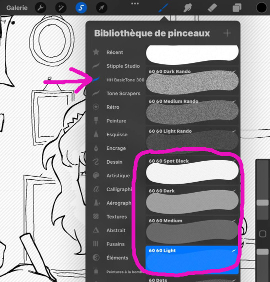
First, I determine what part will be in which tone; the lighter one can overlay other tones, but if you make the dark and the medium ones overlay for example, it will look rather strange:
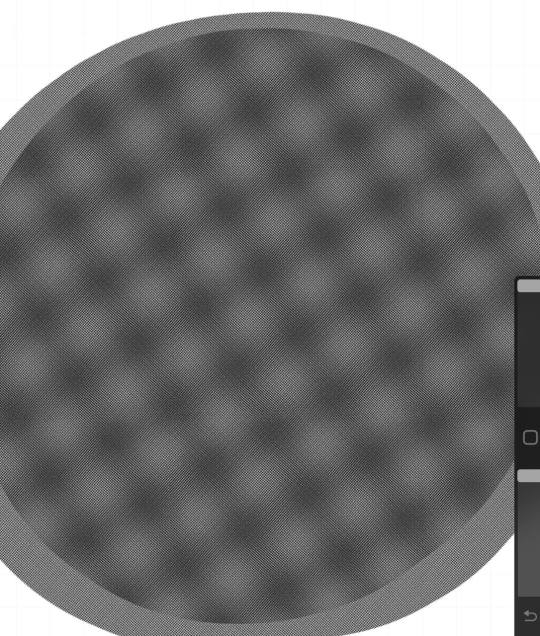
I usually do all the volume work and overall shadows with the lightest tone only, in order to keep a sense of unity in the picture. Other tones are applied much more flatly over big areas in order to make the picture more readable; for example, the dress, the desk, the frames behind and other details are darker.
So I always start with the light tone and make all the shadows, and I end with the darkest tone that I don't use much (I tend to leave most of the dark areas in full black). Please note that the halftones brushes can't be used as pencils, because the strokes overlay and become darker, and it will just look messy; also, if you change the size of the brush, it doesn't change the size of the tone patterns themselves, but only the area covered. Which is super practical.
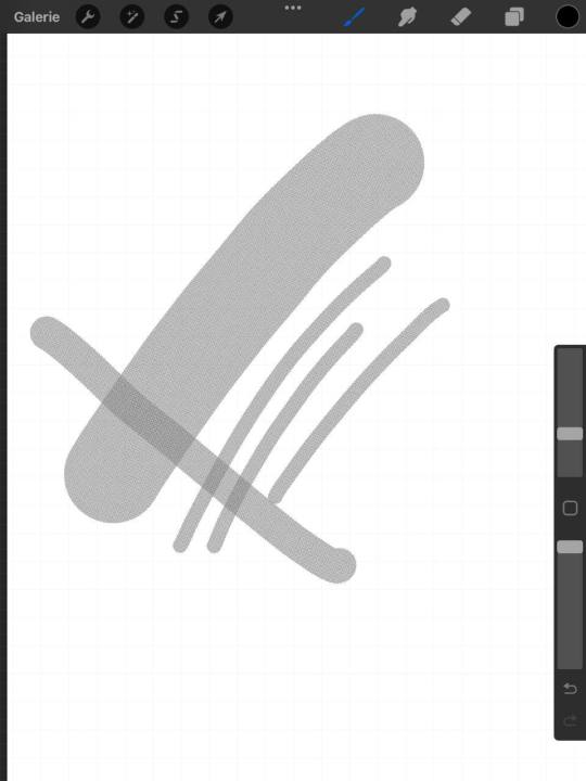
As a result, the best way to use it is to do pretty much what you do with a real halftone, haha. You just have to select the part you want to cover with the tone, and then apply the brush un a single stroke over the selected area (I usually set the halftone brushes as big as I can so that the stroke looks homogenous for sure). Here is what it looks like:
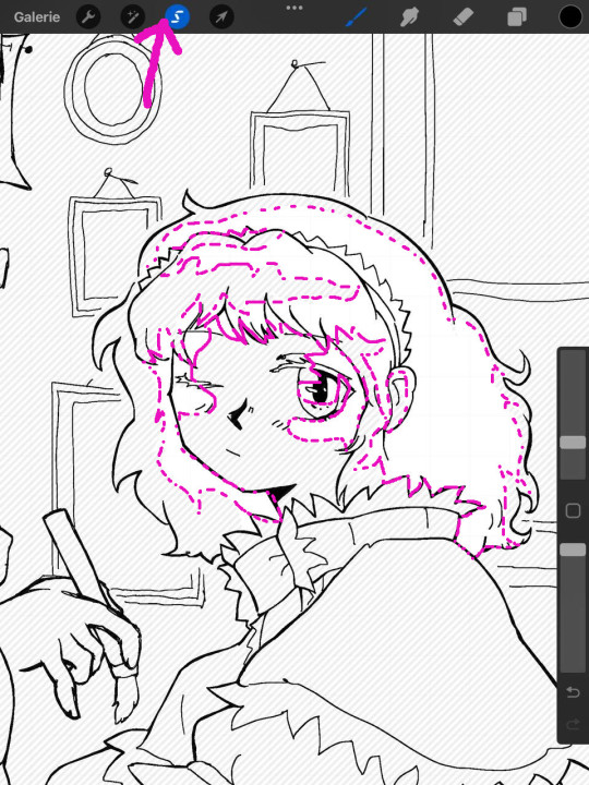
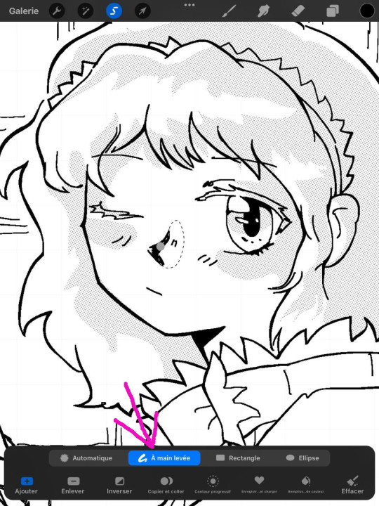
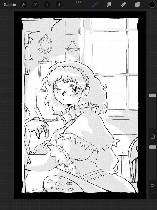
Because I'm extremely lazy (but also because it gives a feeling of unity to the picture!) I usually try to make the whole halftone in one piece / selection. Since the drawing is big and a bit complicated here, I decided to do more parts than that, but you get the idea. As you can see here, I also do smaller parts here and there, like the nose. Because the shadows can look a bit sharp and I wanted the light that comes from the left side of the picture to be smoother, I used a tone scraper that it given with the brush pack that I use as an eraser. Here is what it looks like now:
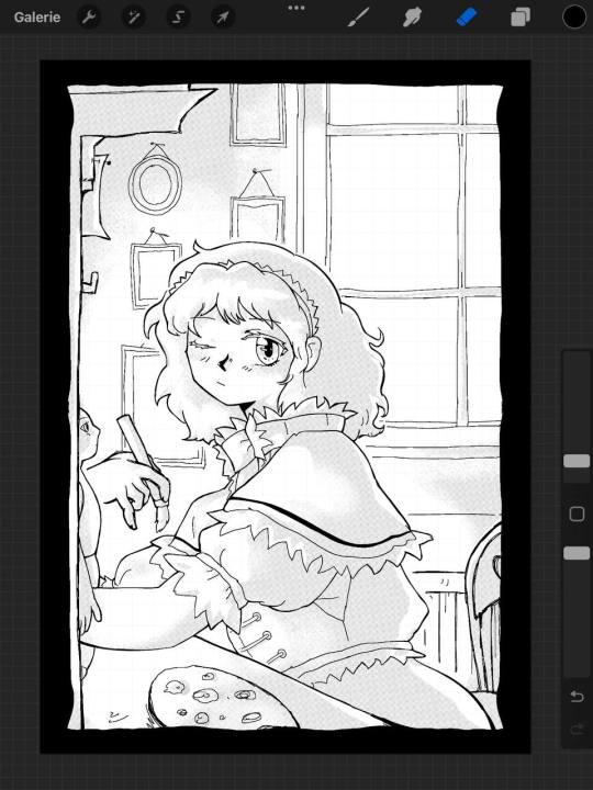
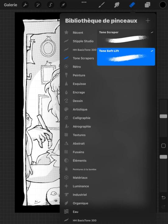
And now, you just have to make different layers of halftones with the other ones. It's much easier now, because I just have to retrace plain areas that already exist in my lineart, in order to make details pop here and there. Here is what the other layers look like if you take them separately. I also erase some parts of it, but I try to keep it as plain as possible in order to make the picture as readable as I can:
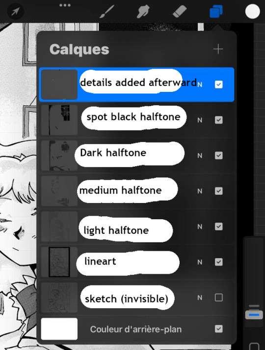
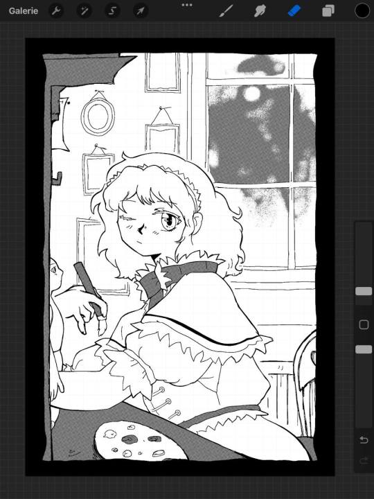
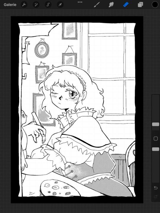
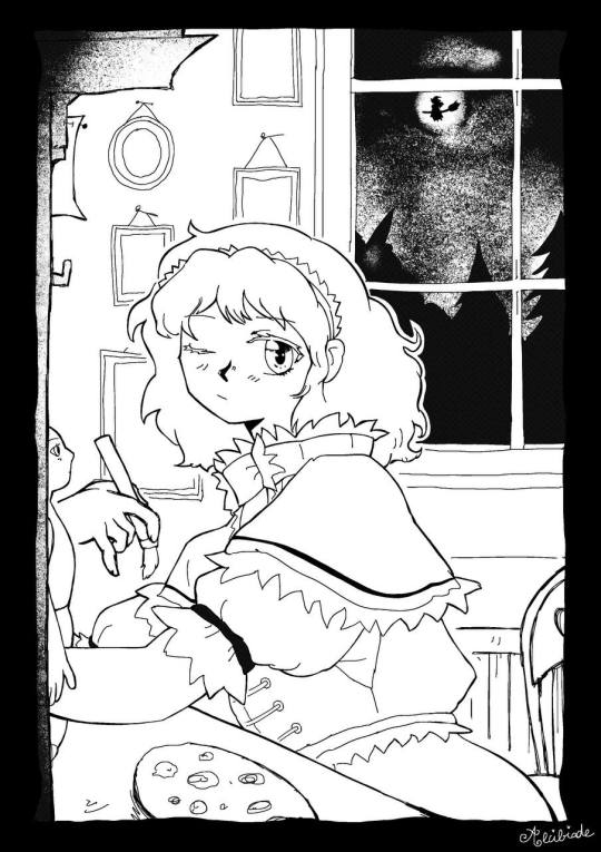
As you can see, I always try to use these tones as a mean to distinguish different parts of the picture that could be hard to read or lack some detail.
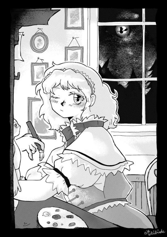
Here is the result! I hope that my explanations were clear and that it will help some people. If you have any questions please don't hesitate to ask them and I'll do my best to answer! (´▽`ʃ♡ƪ)
#my art#alice margatroid#touhou project#touhou#art tutorial#digital art tutorial#halftone tutorial#digital screentone tutorial
11 notes
·
View notes
Note
hello!!! sorry if youve answered this already but what program do u make ur comics on/how do you do the little speech bubbles on ur comics? ur art is so lovely and visceral and overwhelming in the best way possible🫶🫶
im honored youd think i use any program haha, i draw them by hand and it's not fun T_T ! if i want text in them i insert it afterwards in photoshop. but as for recommendations, i hear manga studio is good for speech bubbles? i used it as a kid and iirc it was pretty nice!
65 notes
·
View notes
Text
Blog Moderation FAQs
Hi everyone!
Every time we answer an ask about the queue/inbox situation we get several of the same suggestions in our inbox. While we truly appreciate those of you trying to be helpful, I wanted to take some time to address some of the suggestions and the reasons behind our position on said suggestions.
Have you considered closing the ask box for a while until you work through what you have?
No. With as many asks as there are in the box, it would result in the ask box being closed for quite some time, which we don't think is really what anyone wants!
Closing the box would allow for us to "catch up", but it also would mean potential dry periods of content.
Keeping the ask box open means we need to scroll forever to reach the old asks, but it also means that we are set to deliver consistent content for a while, and are never at risk for an empty queue when the inevitable drop in fandom interest hits.
Why don't you post more frequently?
Actually, we do! We've exploded recently, so many of you may not remember ye olden days of our blog's founder doing their best as a one person show and we got one post a day... ish. Then, when the ask box exploded to 100 asks (haha) they brought in the first round of new mods (including me!). During this time, we were able to build a solid queue. We were then able to post 5-6 times a day.
With a healthy queue and a healthy ask box, we were able to bump the post frequency to 12 times a day. Most of the first wave of mods worked through some asks and then largely went inactive. This is fine, it happens. After struggling to keep up a frequency of 12/day as a one person show once again, we recruited new mods with some activity guidelines.
To maintain a posting frequency of 12 times a day, each mod needs to add 3 posts to the queue a day, or 21 posts to the queue a week. We ask that every mod contributes 30 times a week, that way we have a healthy buffer of content for holidays, emergencies, and just general time away from the internet.
While the confessions are sent in by y'all and editing them in photoshop is a generally simple process, it still does take time. Time in the game to find and take the screenshots, time in the editing software to create the image, then posting and tagging appropriately. Those cursed edits y'all love so much take even more time.
We're all adults here. And your mods are too. They have lives off of tumblr, often complete with bills and day jobs. Honestly, less fun than the little horny blog, but *vague gestures towards capitalist hellscape*
For these reasons, posting 12 times a day is going to be a hard cap for the foreseeable future. In the most loving way possible: If you are submitting an ask now and expecting to see it a week or even a month from now, you are going to be sorely disappointed. Submit your ask and know that it will be appreciated by the community when its time comes.
"A confession is never late, nor is it early. A confession arrives precisely when it means to." - Elminster (probably)
Why don't you just get more mods?
Have you heard the phrase "too many cooks in the kitchen"? Every person added to a process adds another variable, and the more variables, the harder it is to deliver a consistent experience. Additionally, the goal is to find people who can stay pretty consistently active, which can be a hard ask for a lot of people. We're very grateful for the team that we have now, and we aren't seeking new mods at this time.
Why don't you post more confessions about (character/female/etc)?
We are a submissions blog. We work with the content we are given. You need to be the horny you wish to see in the world. I know in general there's a lack of confessions for female characters, and there's an analysis to be made about how different gender/sexual identities interact with fandom and how that affects the content available in communities for consumption, but I'm not the person to make it.
Thank you all for continuing to be amazing, it is truly an honor to serve 🫡
62 notes
·
View notes
Text
The Escaflowne Movie CD Dramas
Time to share some thoughts about the CD dramas I recently posted (one, two). There’s so many topics I will just make a few sections. This is insanely long and... just insane again. So I'm putting a cut right here.
First of all, this was such a different translation project than I’m used to! Meaning, it was spoken word instead of written and there was no official transcription. That is the difference between these two movie dramas and the series drama (Thought of Jeture). ToJ had the whole script in the booklet, so that would make the translation MUCH easier. The only thing we have for these are the summaries in the movie Newtype Artbook. Anyway, it was a fight but I’m pretty confident with this translation.
Speaking of booklets, sorry about the quality of the pictures/scans. For some reason, these booklets are really deteriorating, dunno if anyone who has the same CDs can confirm, but they are yellowing pretty badly and what is worse, in an irregular way where one page is totally different color from the other. I don’t think the environment I store it in is too bad, there’s not a problem with humidity or anything and most of the other materials are fine but ofc, I can’t speak for the previous owner. Or it’s simply a feature. The booklets are printed on some textured, off-white (possibly recycled?) paper in the first place, so they were never white, but then there’s the yellowing. I tried to fix it a bit in Photoshop but when it’s irregular AND in color, my editing skills come short. BTW, I had a similar problem when I scanned Escabible, I just gave up and made it B&W cause the print was originally green on pages that yellowed with time. Anyway, these cd drama booklets have sparse contents compared to some others (there are only the song lyrics and credits and some non-specific artwork), so I included the scans more or less informatively.
Finally, to the contents. This is definitely more complementary to the movie than the novel which takes some different paths. I believe this one was made so that it doesn’t contradict anything in the movie, although some things leave you guessing. We’ll get to them later. Which may be one of the reasons why it's kind of hard to be in the drama setting and not to feel like “this is just another Escaflowne AU” but realize it is an actual prequel/prologue to the movie. It has all the scenes that you would have in yet another Escaflowne retelling, such as:
sketch of Hitomi’s relationship with Yukari
Hitomi’s suddenly getting isekai’d and realizing it by observing Earth from Gaea
Hitomi meeting Van under dramatic circumstances (though I must say this is probably their most civil first encounter, there’s practically no fighting!)
meeting with other characters like Allen and Millerna (the Van and Allen fight is practically a copy of the movie fight… even bears resemblance to their first series encounter)
introduction to other characters like Folken, Dryden, and Dilandau
I get it, I get it. This was a case of amnesia in the end. But we are just more used to AUs in this fandom, haha. I also get you would want cameos to every character with a semblance of a fandom in a new franchise material. But I can’t shake the feeling they weren’t trying all that hard to tie things into the movie perfectly, although the cd drama is described as its prequel.
For clarity, I still consider the cd dramas and the movies the same universe and the things that happened in the drama as canon for the movie. There is also the movie novel, which I will publish in the future, but that one is another beast and I wouldn’t necessarily say things that are true there are some secret lore for the movie that was just never mentioned. It’s more up to the decision of the reader whether you accept them into your movie headcanon (because some of the novel lore contradicts the movie so how much can you believe the rest of it?) The multiverse is quite insane already but yes, this happens, with other titles as well.
BTW, it is neat they included Dornkirk’s seiyuu in the voice of Orm. This is a pretty mysterious character but he fulfills the role of the deus ex machina for the whole thing, never to be mentioned again in the actual movie. It is through him we learn more about Folken and Van, which would otherwise have to be spoken about by themselves in a voice drama/movie, and yeah, we all know the odds of that. Anyway, he is not human. He is not Dragon Clan, because that’s people like Van and Folken. And yet, he changes into a dragon. Is he actually a dragon god? One of the two who created Gaea? I guess not if it’s the two princes who decide the fate of Gaea instead of him. Perhaps he lost his power or there were lesser dragon gods? Or he’s not a dragon at all; it’s just sorcery of some sort. He says he’s just a sorcerer, after all. But he looks like a goblin. It took me a while to realize and you may not remember either, but the movie also has madoushi or sorcerers, except they don't look exactly human.

Rather, they resemble the series Ispano and their work with on Alseides confirms this. So now I believe this Orm could possibly be one of these guys (maybe before whatever it is that got done to them?) and he shows his true form to Hitomi. And when you think of it, much like Ispano, Orm acts as a sort of “insurance” against world destruction. The topics just keep recurring it seems.
Anyway, I just made some notes about these cd dramas and grouped them according to the topic.
Physical descriptions of the characters
If you introduce a character in an audio drama like this, you have to introduce them through the narrator’s voice, similarly to a book. That’s why Hitomi has to spend more time describing Orm’s shiny eyes, protruding teeth, etc. than she does with the known characters with a known design, who, all with the exception of Van, get just about one sentence. She spends some more time describing Van and although she observes how “beautiful the two look in their fight” (I had to make a note of that), she never spares a second thought to Allen, or any of the other handsome men she sees. No more love triangles, the soulmate game here is too strong!
Anyway, in this material, Hitomi describes Van’s eyes twice with a word that literally means “see-through”. It felt odd but it is apparently a set expression, unless they tried to involve some double meaning. It’s apparently a synonym of clear/shiny/sparkly/pure/beautiful eyes… you can buy contact lenses that promise to do this for you in Japan lol. I translated the novel as well and there are more strange descriptions of his eyes in there, maybe that’s why it felt so significant. There is also a bit of a difference compared to the series materials, where they would just describe the color in a way you would describe a specific shade of blue or any other color. In any case, however literally or not they meant this, Van has pretty eyes, as we already knew. It was also funny when Millerna described him as cute and connected it to whether he would want to join Abaharaki. Like a cute face was a prerequisite or something lol. But she’s probably on about him being too tsun despite the face.
Another thing we discussed during editing was this “sign of the king” that was shown already at the time of Van’s birth… and wasn’t at the time of Folken’s. At first, I thought very simplistically that it may have something to do with the tattoos (or would they be markings then)? But that doesn’t seem to be the case and they are confirmed to be tattoos for the novel, although it doesn’t seem anyone else from the Dragon Clan would have them there. In the movie, on the contrary, young Dune and even Van’s mother are shown to have them as well, so the meaning of them could have been different. Back to the “sign of the king,” I returned to that part of the translation later and it seems it was something that the seers saw in their prophecies after all. Some symbol of the dragon king that was not specified. Sidenote, I pitied and blamed Dune’s mother at the same time. Poor guy.
This got all about Van again but I don’t think anyone else was given enough description to even discuss? It’s clearly obvious who Hitomi’s love interest is. I would say it makes it clearer than the movie itself, because it has these inner monologues and it’s pretty romantic already despite the two barely knowing each other. I would even say Van’s behavior is gentler than any other iteration (?) But when you think of it, the cd dramas are usually THE fanservice materials, aren’t they? So obviously, they would give most attention to the popular characters and ships… but let’s get to the more pragmatic stuff.
When do the Prologues take place?
The two prologues obviously happen before the movie but how long before that? Let’s check some placeholders and see what we can figure out.
“the winter of my sixteenth year” “not even a spring break yet” “soon, you’ll be a third year”
High school in Japan is three years with the school year starting in spring. So I believe this is happening at the end of Hitomi’s second year. Her age of 16 fits. In the movie materials, her age is described as 17, so somewhere between the two, she also has her birthday. Could it be in December, same as in the series? That would make the window for the drama very narrow, because it’s winter but not yet 9th of December. We can't probably take that date as a reference, anyway.
“is the way to the Mystic Moon closed now?” “yes, for now. But once the moon is full again…”
This is something Folken and Sora speak about in cd 1 when Van deflects Orm. But then it is Van who reaches out to Hitomi first before they can do as they plan. At the end of cd 2, Folken asks Sora to open the path again so I assume these conditions still apply. Then the movie may be one or several months after the events of the cd drama, since they need the full moon. Well, if the Moon works and time passes the same on both planets…
I believe this takes place in a range of one to few more months before the movie. Why? Folken asks Sora if the way to the Mystic Moon is closed. And Sora says, it is, "but once the Moon is full again..." Unclear which moon, but we could assume their moon, the one with the eye. Looks similar to our moon, and if it was the same, it would have been one month. But then, the movie is definitely not taking place in the winter, like this drama. So, when is it?
Let’s look at the placeholders from the movie directly. First thing we have is Hitomi’s watch, which says, SA 18th, 16:15:28. Normally, SA would stand for Saturday, the screen of her watch (or the information on it) even looks pretty similar to existing models of Casio Chronograph/Illuminator:

You may wonder why she would be at school on Saturday afternoon but it was normal at the time of the movie production, Japanese students only had Sundays off. They talk about some plans next day on the train right after the rooftop scene and Hitomi asks Yukari to give her a wake-up call in the morning, which would fit. You see them having a bit of fun and it doesn’t seem the next day yet, they are still in their uniforms. Later at the stairs (although it is not in the subs I had), Yukari says they will see each other at school tomorrow. But shouldn’t it be Sunday next day? Or is what we see already the next day, the thing they made plans for? But why not dress casually, then? And aren't they on the train to/in Tokyo already when they discuss this? I guess this theory is not too likely, then.
It’s actually baffling. Because the scenes also do not follow in a linear way; you see them on the train, there is a shot of Hitomi at the stadium already, then they walk around Harajuku/Omotesando, and back on the train where they are held-off because of an accident at Yoyogi. Yoyogi station is on Yamanote line, the circular line going around Tokyo. That station, Harajuku, Omotesando, Meiji Jingu, National Stadium… it’s all in the same wide area but maybe it’s a bit too much for walking, unless they had a lot of time. I mean it would take them almost two hours just to get to that athletics stadium if they left their school right after the roof scene at 4 pm (according to her jersey, the school is still in Kamakura). But they don’t even have their school bags, Yukari just has a small shopping/gift bag it seems. Did they put them in a coin locker on the station or something? In the novel, they just run away from school (or rather, from an angry teacher), so that would make sense with the bags if they at least had some money on them but it seems too late in the day to do that. But I guess it’s still the best explanation. The sun sets around 7 pm at that time of the year in Tokyo. But that still doesn’t explain why Yukari says “see you at school tomorrow” when it should be the weekend. If she meant cram school, guess she would say that and not school. Maybe there’s something I’m missing that puts it all together. Or they are doing this on purpose. EDIT: I just reread this for possible typos and it came to my mind that the plans Yukari and Hitomi have could be for Sunday AND at school. Yukari says, "you promised, remember?" which made me feel like she was worried Hitomi would just cancel but it may actually be something of a favor to Yukari? IDK, for example, helping her cleaning the club room or something? She DOES use "kureru" which means that she hopes Hitomi will do this "for her". That's a thought...
Anyway, I researched the watch a bit and if the display was really like a digital Casio Chronograph, we wouldn’t know the month from looking at the screen (some models have the full date but this type, only the day of the month). But what can we guess about the month from the movie itself? It's not full-blown spring, otherwise we would see at least one blooming sakura tree, I guarantee it. In similar vein, if it was the height of summer, there would be sound of cicadas (June to September). Late spring/early summer or early autumn is my best bet based on the greenery we see, plus Hitomi and Yukari wearing the summer uniforms (the school uniform would have a version for cold and hot days) and people wearing tshirts and summer dresses in Tokyo. Then it would be about half a year after the cd drama.
But here’s a crazy thing: Hitomi’s watch is shown once again on Gaea and it has SA 19th 17:05 on it. It is the next day compared to the roof scene where it's 18th but also it's still SA… This confused me so much I even checked the settei but I didn't learn much besides that it's her favorite watch and the pattern you see above the screen is an image of an angel that can be backlit in the dark and that she only checks the time once while on Gaea. The settei uses the time from the roof scene btw.

So does the SA stand for month after all? SA for sangatsu (March)? It doesn’t look like March in the scenes with Yukari, I mean, March is the graduation month, remember? Sakuras would be everywhere and they would wear jackets. Could it be then they simply forgot to change SA to SU? That would be the smoothest explanation in fact. Or is there some significance to this? Something something her watch has stopped like that time at the Tokyo Station when she was a child? Anyway, let’s recap the options, since, as usual with the franchise, there is a hole in each and every one of them:
If the roof is on Saturday 18th and the stadium are the same day, then next day we see her watch on Gaea and it’s “SA” 19th… then where did they leave their school bags and why is Yukari telling Hitomi she’ll meet her tomorrow at school if it should be a day off?
If the roof is on Saturday 18th and the stadium on Sunday 19th evening… then why are they wearing school uniforms on Sunday and why are they on a train to Tokyo on Saturday and why should her watch show the “SA” 19th 5 pm after she came to Gaea and slept for some time at the caravan?
If SA is not for Saturday but for the month of March and the roof scene could be any weekday… then why is her watch different from regular Japanese digital watches and why doesn’t it look at all like March outside?
And if SA is neither for Saturday nor sangatsu... then WHAT? I think it could be a subtle “Stop Asking” by the creators, lol.
Or, you know what, her watch did not take the interplanetary travel and the liquid in Escaflowne cockpit too well and broke. That’s my best explanation offer I guess (besides an animation error).
Why does Van not remember Hitomi in the movie if he has already met her?

I consider this the elephant in the room: okay, Hitomi went to Gaea before but Orm used his magic to bring her back and make her forget. But what about everyone else who met her, back on Gaea? Which would be Van, Allen, Millerna, Gaddes, Jajuka, Sora, and Folken? I believe some of their reactions in the movie, but especially Van’s in the beginning, confirm that they don’t remember that encounter.

But how can you erase someone from several people’s memories at once? Even if you erase the memory of her, her actions on Gaea leave some impact… Folken literally swears to bring her back again and he does in the movie. Moreover, in the cd drama, the location of Escaflowne is revealed to Folken through Hitomi’s ancient memories (as Sora spies on her telepathically). The first scene of the movie has Van stealing the armor from Black Dragon Clan’s ship. I believe this ties nicely to the “Escaflowne is discovered underneath Torushina” from the ending of the cd drama. Basically, some time has passed, and BDC dug out Escaflowne, now transporting it to Folken. Meanwhile, Folken is trying to summon Hitomi back because with her and Escaflowne, he apparently has all the ingredients for his plan.
When it comes to Abaharaki, apparently, the cd drama gives us a scene of their first meeting with Van. So, it has not been all that long that he was with the Abaharaki. But since he is with them in the movie, this event from the cd drama is also something that did not get reversed by Orm sending Hitomi back. It’s hard to wrap one’s head around. Allen, Millerna, and Gaddes come across Hitomi and Van because they were apparently in the vicinity and “saw a light”. This is all happening in a “holy land” that bears the name of Arzas, btw.
But if Van wasn’t summoning the Wing Goddess, why would he even go there? Why would Allen come check if there was no light from her arrival from Earth? Of course, the meeting of Van and Abaharaki might have happened anyway, by pure chance. After all, Merle in the movie says they “met on the battlefield”. For the Abaharaki, they “could not take a better look” at Hitomi before she was snatched away by Jajuka and they’ve never seen her again in the drama. So I guess their movie reactions would be plausible even if they did remember Hitomi’s first arrival in the cd drama. But Van is just a big question mark and either their meeting “never happened” or his memory got erased.
So Orm changed into a dragon and took Hitomi, her memories, and apparently Van’s memories away. Then what, was Van just left standing there, wondering what happened and why he even went out there? How about Merle, who went with him to rescue Hitomi? She would remember that the Wing Goddess was there, wouldn’t she? Even though she hasn’t seen her in the cd drama. This adds Merle to Allen, Millerna, Gaddes, and Mole, who form a group of characters who knew of the Wing Goddess coming to Gaea but wouldn’t know her face.
Then we have another group formed by Van, Folken, Sora, Jajuka, who had also seen her. Out of all these, Van is the only one who is confirmed to have forgotten. Others may as well remember everything, because they go retrieve Escaflowne and eventually Hitomi. Interesting. So I guess the first group may remember her arrival, they just don’t know how she looks. The second group, minus Van, could know everything. Van was apparently made to forget by some effect of Orm’s sorcery. Either he forgot her face or their whole encounter. That, or it never happened.
Another variation is, only Folken and Sora remember Hitomi. I guess that would make some sense, since Sora seems to be the one ‘in the know’ about everything, together with Orm, and to some extent, Folken. Then again, Van is a pretty strong magic user himself as we discover, so why would Folken and Sora be able resist Orm’s magic and not him?
I guess this could be explained by Orm’s final scene, where he sounds pretty mad at Van. Which is interesting. He’s not cross with Folken who wants to destroy the world, he’s angry with Van cause he is using Hitomi as a tool for his revenge which will just cause her more sorrow. So, does he in fact only seal her away from Van or erase only his memories? Because Van is not ready to lift Hitomi’s spirits and ease her loneliness? It seems Orm puts some hopes of saving the world into Van and is disappointed that he doesn’t realize what he needs to do. Then again, how would sealing Van away and leaving the path open for Folken help? Perhaps Orm meant to seal her away from both brothers but Sora overcame that magic? It’s frustrating that they just won’t.let.us.know.
But I believe Van having no memory of their encounter could be why (besides the obvious resonance of their depressed souls) Folken is the one to bring Hitomi to Gaea in the movie. Van isn’t even trying to reach her anymore like he does in the cd drama, it seems he is 100% focused on obtaining Escaflowne. Which I guess was his mindset in the first place even as he, on his own volition, went out and whisked Hitomi away from Earth, which coincidentally made for a pretty romantic scene but you can still see he’s all about obtaining the armor. I mean it is logical, once he knows BDC has Escaflowne, it means everything to take it out of their hands. It is also sort of parallel to the series when he asks her pragmatically and logically to help him against Zaibach without considering her feelings.
But really, nothing like, “You’re the Wing Goddess? Few months back, I tried to summon you from the holy land of Arzas, using all the magic taught to me by the beast clan but you left me on Read?” Ahh yes that would be uncharacteristic to disclose by this particular character, I get it.
So what do you think? Did Orm make him forget or did he revert Hitomi’s whole first visit to Gaea?
“Ancient Gaea”
What is also pretty blurry is this whole “Wing Goddess lived on ancient Gaea and she met Van then… but she has forgotten.”

Okay, what do we know of this “ancient Gaea”? We know the Wing Goddess as well as “Van” in some form lived there and then. And they were “alike” in some way. Orm calls them “twins” or “gemini” which I do get may sound problematic (I translated it as “two of the same kind” in the end) but I don’t think he means they are related. Also, “dragons” lived on this Gaea. I don’t know, as I listened to this part with the series soundtrack in the bg, I suddenly got the feeling like they talked about the series. Which makes not much sense of course. There is no proof of that. Movie Escaflowne is different, the series one didn’t destroy the world… it doesn’t work. But I still got a nostalgic feeling like that.
Then the last thing we know is Escaflowne actually destroyed some major city… I guess, likely in battle with the movie Alseides, they just laid ruin to this ancient Gaea civilization, whatever it was. In this battle it seems, Escaflowne could have been buried by rubble of what could have been the predecessor of Torushina, which itself could have been gradually built upon the ancient city ruins. That’s all we know. Anyway, I kinda hate when Sora teases like “could we bring back the ancient memories of the Wing Goddess?” Don’t give us hope if you’re never, ever gonna deliver, dammit. Maybe I should deliver in fic form haha (no I will not start another project).
Random thoughts after watching the movie after having translated the drama
Now that I think of it, the movie actively avoids any direct reference to the events of the cd drama. But after giving a proper attention to the CD drama, you see echoes of it in the movie, echoes of Hitomi remembering on some level after all. Like, when they are frolicking with Yukari, and she hears Sora’s song… she immediately understands someone is calling. It’s not “I hear a song nobody else seems to hear” anymore, it’s her immediately understanding that Yukari doesn’t hear it and that she’s being called.

BTW, what I humbly believe the movie subs/dubs could have done a little better was the scene with Yukari at the stadium. Hitomi tells Yukari she’s annoying for meddling in her life. She says “annoying” and “just disappear” repeatedly and there is this transition from when it seems like she’s really calling Yukari “annoying” and muttering she should “go away” to when you understand that she is talking about herself. Hitomi is the “bad guy” and she’s the one who should “disappear”. If you use “fade away” it doesn’t click so much because you don’t tell another person to “fade away”.
Also, in cd 1, when Hitomi sees Van for the first time and the dragon fossil in the face of the mountain. I got this weird feeling it could be Van just before he takes off to kill everyone on the Black Dragon Ship and steal Escaflowne in the very first movie scene. Because yes, we see the mountain with the dragon fossil in that movie scene (presumably one of the twin gods Van prays to), he prays for the death of his enemies (that he does massacre in the movie opening scene), even the music is the same... because Bird song is the first part of First Vision, the OST for the first scene of the movie.

Or perhaps, for Hitomi's “first vision”, and it refers to this scene from the drama? Of course, nothing gets confirmed here either. Anyway, if she sees Van in real time, what would he be doing at the time she’s under Orm’s spell on the train? Well, apparently, he is aware of Orm’s actions, and with support of the elders from the wolf village, he is trying to intercept him. Which he does later, in the cave. But would his preparation for that be this? Wishing death upon his enemies with the sword drawn and then flying off… idk, it fits the movie scene better.
This post got really speculative so I’ll just stop here but I think I’ll make one or two other posts. One will just have the movie trivia without as much of my speculation. Another will be a bit critical because while I like Escaflowne in all its forms, I did get a bit frustrated here and I should let it out.
14 notes
·
View notes
Text
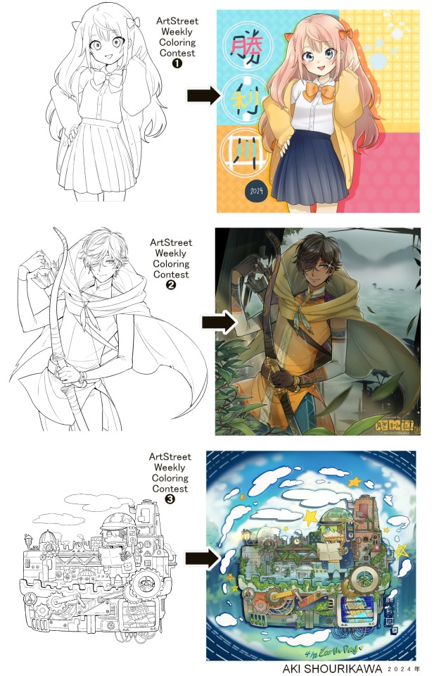
Blog No.003🍊 24年5月10日
「Let's Talk About Coloring+Rendering!!」
~ The Chaos of Akehhh-style Layering w/ Colors & Values ~
ArtStreet recently released some weekly coloring contests and as someone who likes joining 'em + colorwork being the absolute joyous part in drawing for me, I got really into it!! One of them somehow won and I still have the raw .mdp file of it with most of the layers unmerged... so, I thought there might be some value in sharing my chaotic coloring progress with it. There may never be an opportunity like this again...
CONTENTS:
Preface・・・・・・・・・
The Linework・・・・・・
Composition + Planning・
The Render・・・・・・・
Additional FX Tips・・・・
The Layers of Dread・・・
1. Preface
I use the free software MediBang Paint, which is made by the same folks who made the aforementioned art-sharing website, Artstreet. Although its file type extension is .mdp, it can also save as and open .psd files all the same.
If interested, you can download it on their website here! I believe it's available in both PC, Apple, iOs, and Android (also on the PlayStore). ☞And here is my google drive link of my fully rendered entry's raw .mdp file. I also included a .psd version that should be accessible with most other softwares like Photoshop, Clipstudio, etc.
NOTE: Not sure how some layer effects will be displayed apart from MediBang though (either in name or function) . But I think "multiply" and "overlay" is fair game on most drawing/photo-editing softwares with layer systems.
Either way, ↑this is just a bonus thing if you wish to see for yourself how much my MediBang cries everytime I work on something, since visuals of the rough step-by-step will be provided here as well!
At the end of this post, all of the layers' purposes will be explained...y-you'll see...
■And just as a disclaimer: I'm an instinctively self-taught illustrator who is a heavy visual learner, so there are certain methods I do that I cannot readily explain with back-up studies on color theories or formally taught techniques in art schools and the like/certain made-up terminologies that may or may not exist as something else. I mostly operate on instinct, observation, subjective preferences, and vibes, so this would just be me trying to verbalize my process (with visual aid) as a means of share-rambling, rather than actually directly "teaching" anything, I think haha You can take it as a cautionary tale too, honestly-
※I will also be going through this with the assumption that the reader has some background knowledge on digital illustration and general drawing basics + lingo. If you have any questions or needed clarifications, please feel free to let me know!
Although art can be fundamentally "wrong" when it comes to achieving certain specific styles, structures (especially when involving realism as the standard), or general executions of intentions/themes, I am of belief that there is generally no wrong or right 'way' for drawing anything; or for doing ANY type of artistic endeavor for that matter. This might be perceived as a "bad anatomy defender" / "no need to improve, then" stance on my part, but it is absolutely not the case! An artwork is never finished, there's always room for improvementsーa galaxy's size of a room especially for myselfーbut I just think anything at all that brings you an expressive or creative outlet, joy, or peace of mind is worth pursuing, regardless of your own skill or tact and there's no shame in that. I do not wish anyone, especially people starting out with drawing to be discouraged for having their own different approaches in comparison to other people's works by misconception of, "oh, am I doing it wrong?". Sometimes having different or an uncommon worldview is not always a 'bad' thing, I think. Heaven forbid artists actually start getting creative and unique―
What I will be presenting here is simply my one way out of thousands of thousands of different possibilities. So, let's start★
2. The Linework
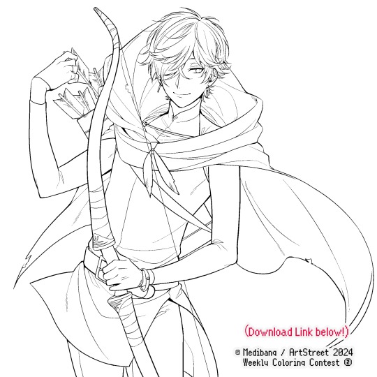
Equally lengthy talk of lineart is probably for a later discussion, but here is the template provided by ArtStreet for the contest + what will be colored in for today.
☞The contest has since ended, but you can still download the lineart template here if you'd like!
3. Composition + Planning
The contest rules said it's "OK to draw backgrounds", so let's go!!
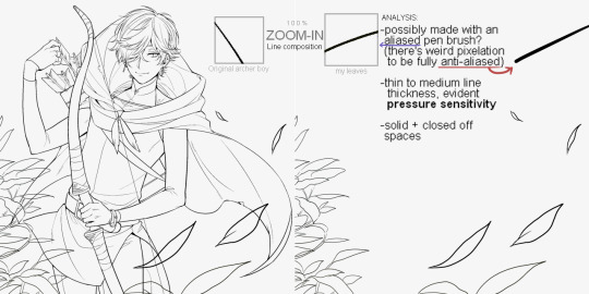
I had already decided on how I want to color it early on: It will be more scenic in nature, rather than stylistic. So, there will be more focus on looking 'real' than 'aesthetically stylish'! Just so it doesn't look disconnected or too out of place, I tried to draw my additions similarly to how Mr. archerman's linework looked as much as possible.
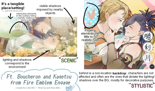
This how I visually define "scenic" VS "stylistic" illustrations (in my head)
I like experimenting and mixing different rendering techniques with varying linework styles and tend to think about my approach with the rendering long before the coloring process, even waaay before I line my final sketch, usually. But for this, I'm simply working with what was given to me.
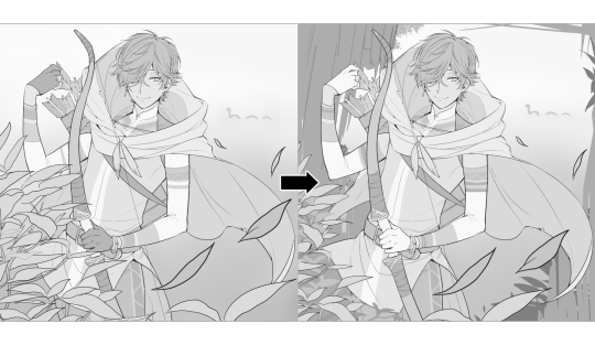
At first, I just wanted a "cool breeze w/ leaves flying away ahhhh refreshing~~" mood, but the space at the side of his head looked rather empty as is, even with Nessie. So I thought about putting him inside a vague...darkly-lit abandoned ruins-setting to eat up some of that space.
And with that, it's time for colors.
4. The Render
My coloring process is the lengthiest and often makes people who see me color in real-time scream in horror, but I think it's actually fairly simple and can be summarized into three nutshelled stages:
①Fill in the colors with a finalized palette of your choice,
②cry Continuously render until your arms fall off you're satisfied.
③ cry even HARDER (optional) Adjust accordingly to fit in better with other elements of the illustration, such as with the focus/subject to background. *will be explained later.
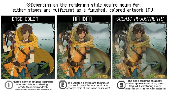
oh and btw, the usage of the words 'render(ing)' tends to be confusing with its association with other mediums like 3D models, but when it comes to drawing I like to think of it this way:
🎨Coloring is the planned/intentional selection of your color range, tints, tones, and palette to use in a drawing, ☀Rendering is the act (or product) of the set of techniques (including effects, filters, etc.) you use with the colors/values to create the illusions of depth, shadows and light, movement, warmth/cold atmospheres, etc in a 2D illustration.
But that's just how I define it with my own step-by-steps. Otherwise, I think either term is pretty much interchangeable.
Anyhoo, what do you think should this man's hair, skin, eye, and clothing's colors be?
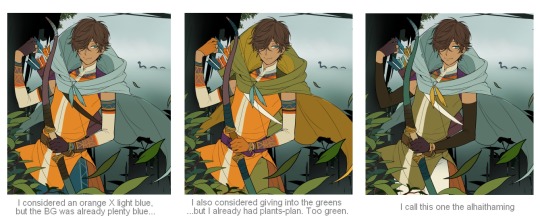
here are some of the variations on the color picks of his outfit that rotted my brain for about 3 hours straight, like it's a 2000s dress-and-match flash game
The many submissions for the contest had many fun color combinations and interesting interpretations I personally think should've won. I saw a lot of blonde archer-princes wearing greens, browns, and blues, as a lot also went for the "forest hunter boi" vibe. But I was saddened by the lack of my favorite colors being used as the primary colorーorange and yellow. So, let's use those!!
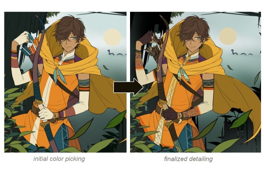
The start of my coloring/rendering journey is never at Layer '1'.........
―Starting with what I've always referred to as "environment prep":
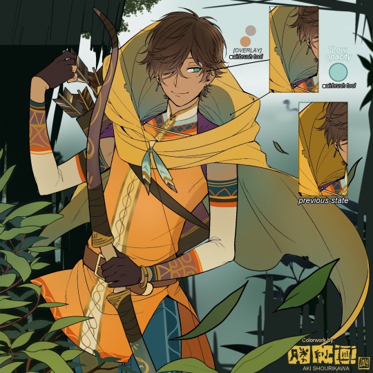
The purpose here is to 'set' the base colors so they match with the environment or general atmosphere. Get ready to see this over and over
This could mean adjusting the saturation, or spraying gradients of the BG's most prominent color on parts that...gives me anxiety the most-
As someone who tends to work with very, very bright color schemes with character designs, trying to blend in when the illustration is meant to be scenic or 'serious' in tone without it being a distracting eyesore can be a challenge. So, this is what I do to counter it.
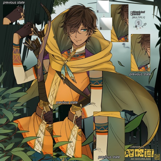
Shading is usually an early step for me as well, even though I think it's a lot of other artists' near-to-final step. I tend to lean towards an abomination mix of soft shade and cel shadeーthe strokes are sharp enough to trace where the shadows start and end, but softened around the edges for effect.
I also tend to apply an additional spray of subtly darker shade on top of the first one? It's usually on spots where I think the light source won't be hitting as much. I wouldn't do this for simple styles (stylized illustrations like with a chibi style), but for scenic illustrations I find it's necessary to achieve that depth against a fully-rendered environment.
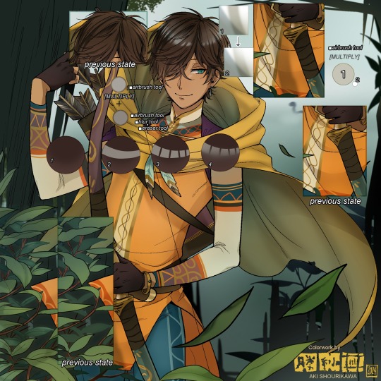
※Just a side note: You may see multiple things changing around, but in real time I'm most definitely working on one part at a time lol. These visual aids were ripped off the raw .mdp by hiding some of the layers, so that's why different areas seem to progress together all at once, even if that's a bit idealistic in actuality.
Apart from the previous adding of shades with a multiply-mode layer for the preliminary shadows, I add one more layer of shadow on there for objects or other characters that can cast distinct shadows on the subject. In here, it's the bow and the hovering strap across his chest.
Lighting is also starting to be added as well.
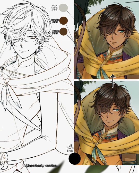
One direct alteration I did with the lineart template was change the line's colors. I find it really softens them to mix better with their filled-in colors + as well as not stand out too harshly against a light-colored scenic background.
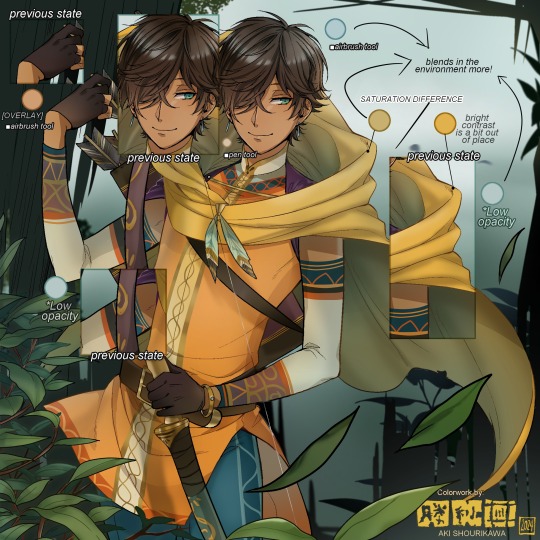
I think you now have a good idea over my hyperfixation on making sure colors are 'vibing' well against the BG lol A lot of these steps are basically just doing the same thing over and over with new layers for the sake of this purpose, really.
And after that, just repeating all the stuff we did with the character onto everything else (background, foreground, objects, etc.) until you're satisfied with it!
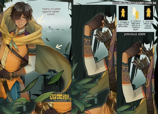
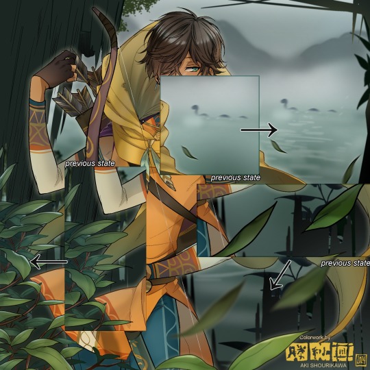
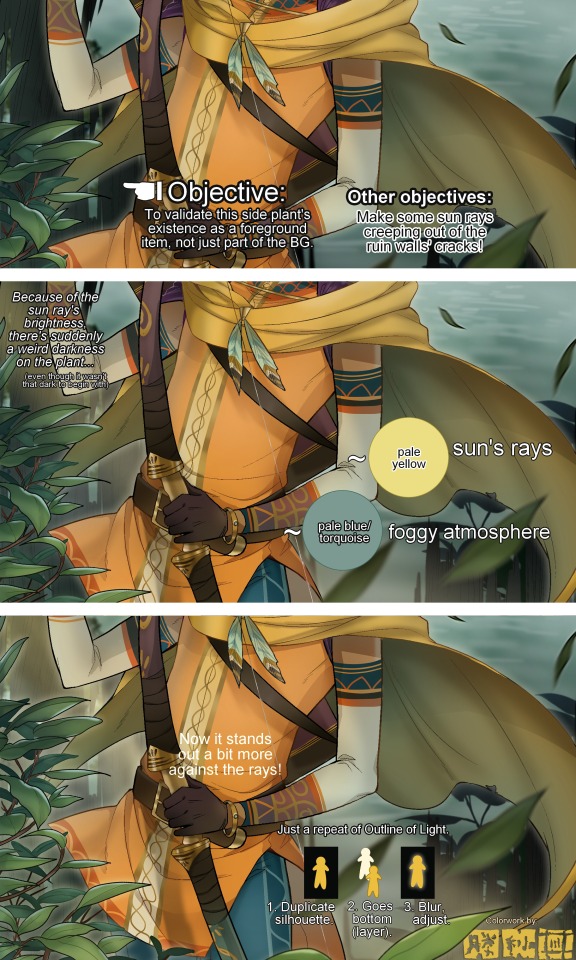
A lot of these changes are very subtle on their own, but makes all the difference in the bigger picture, I think!
Just maybe some additional finishing touches for some boom shakalaka and...that's pretty much it! You will notice that throughout the entire process, there's a lot of random little things that suddenly appear or change with seemingly not much purpose or meaning on its own. I unfortunately have always drawn in this sort of vague, quickly impulsive, directionless way since I was a child and I don't think even I will ever understand it, logically. It's mostly a... continuous string of instinctive feelings of "HEY let's do it this way, if not there's like 10 other things we can try next", is the closest I can get to an explanation of how it feels.
I don't know if it's common for other artists to think or function this way, but I do know for a fact that many people seem to be surprised and confused when they see me drawing in real time this way. Everytime I get asked 'how' I draw certain things, I say things like 'I turn my brain off and vibe with many, many layers with a broken back.' and people think it's just a dismissive joke. I-it's really not, it's literally what happens, I don't have any secret shortcuts for you-
Hopefully this very lengthy post + visual aids can help demystify some misconceptions on what "really" goes on when I'm drawing! It's also a bit of an update of my tutorials made for friendos starting out with digital drawing back in 2015!
Anyway, the rendering stage is where the simplified steps ② and optional step ③ branch out like a fork in the road for me; I don't think one is any "better" than the other, I think doing either is simply a matter of personal preference and artistic choice;
➋being leaving all that 100++ layers rendering that we just did alone and calling it a day,
➌being a little bit more extra w/ additional shadows/lighting that corresponds with the environment the character is in.
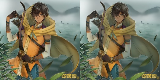
I removed the walls to see the whole figure better in a side-by-side comparison. I like the unadjusted (L) without the wall, but with the walls in the final illustration, I think adjusted (R) felt 'right'. What do you think?
There are some things, although realistic, don't look that good as a visual aesthetic and are just downright excessive/unnecessary to add to certain types of illustrations.
Then there's things that aren't possible in real life, but artistically? Looks really dang cool. Being biased for either ends of the hyperrealism and hyperstylized spectrums of styles is fine; only as long as no discrimination is involved towards people who don't share your opinions, in my opinion-
and to conclude this section, I say,
『 You go render however you wantーhellーno colors even necessary if you wish!
Simple ≠ laziness, just as much as complexity ≠ skill。』
I will never stop yapping about how a lot of minimalist styles require so much more amounts of planning and effort to make sure everything is nice and clean, especially compared to mindless rendering loops like these. Mine's a maximalist hell and I wouldn't have it any other way, but I greatly envy minimalist artists that can render with just something like my step ① with so much grace and tact; not a single stray or wasted stroke!! Anyone who dismisses these types as "lazy" I will violently stuff inside a couchーwithout any potato snacks to snack on!!!
5. Additional FX Tips
Just a shorter section for some optional finishing touches tips'n'tricks used in this I frequently (ab)use☆
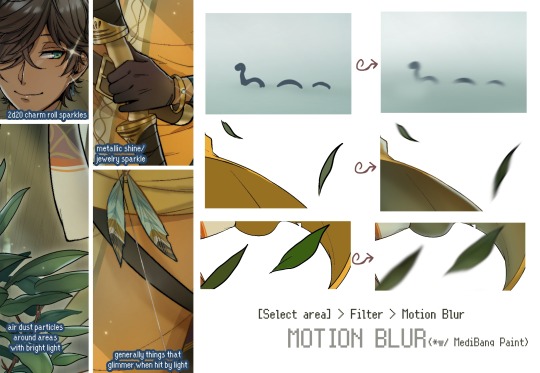
◆ From the very beginning, even before I understood how to draw, it's always been a tradition to doodle around sparkles all around the place. I usually do it with MediBang's sparkle brush if I want it to look polished, or simply draw it manually using either the pen or airbrush tool for a cruder charm.
◆ Motion blur is great, and MediBang in particular also has different types of blur effects like Gaussian and regular blurs. If your software doesn't have these effects / if you're working traditionally but still want to achieve the illusion of motion in a still drawing, you can still achieve the same effect through your linework! Try looking into incorporating action lines (commonly seen in manga and comics) into it. Otherwise, purposefully drawing something blurily to begin with oughta work as well.
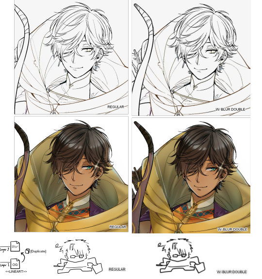
◆ Apart from changing the lineart's colors, there's also this little effect that is achieved by duplicating the lineart and blurring it. It gives something like a...'dreamy' quality to it? The higher the blurred copy's opacity is, the more emphasized it makes everything look.
6. The Layers of Dread
At long last we've arrived... at my MediBang's repeating demise for all of eternity...
Here's a preview of what the .mdp/.psd file of this colored entry's unhingedmerged layers looks like + how I try to validate their existence. When I work on full-sized illustrations, I tend to merge layers as I go, so this is probably one of the rare times I can show something like this without either mine or your PC dying. If you'd like to see, play around with, and toggle them for yourself in all of its............glory, feel free to download it here.
Yes
we're starting at Layer 611. Enjoy.
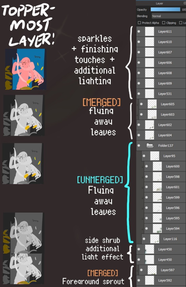
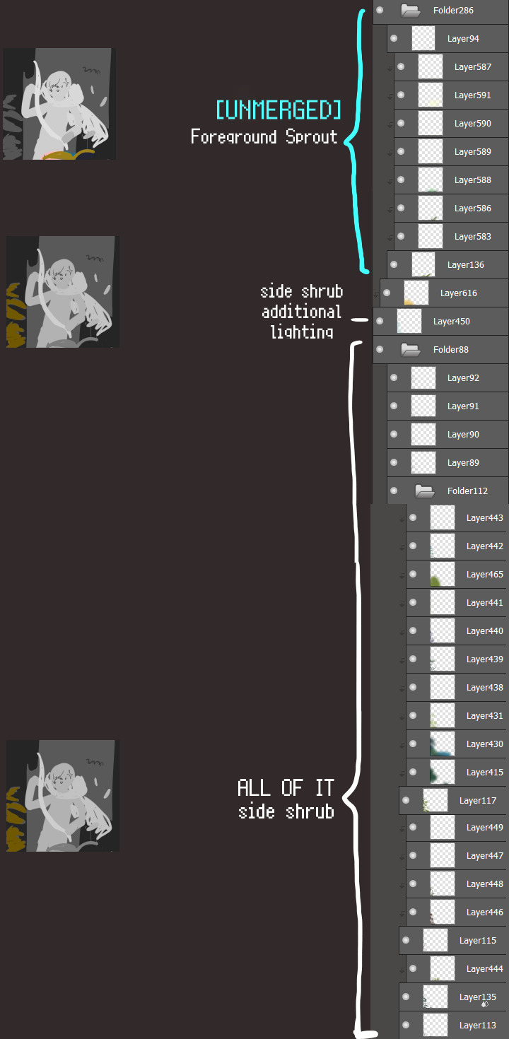
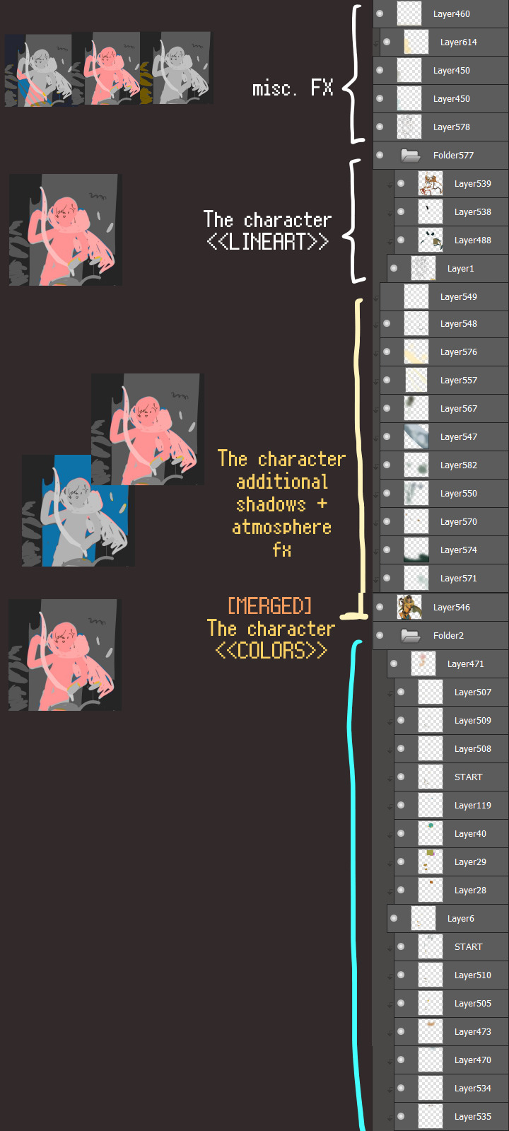
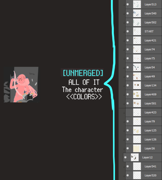
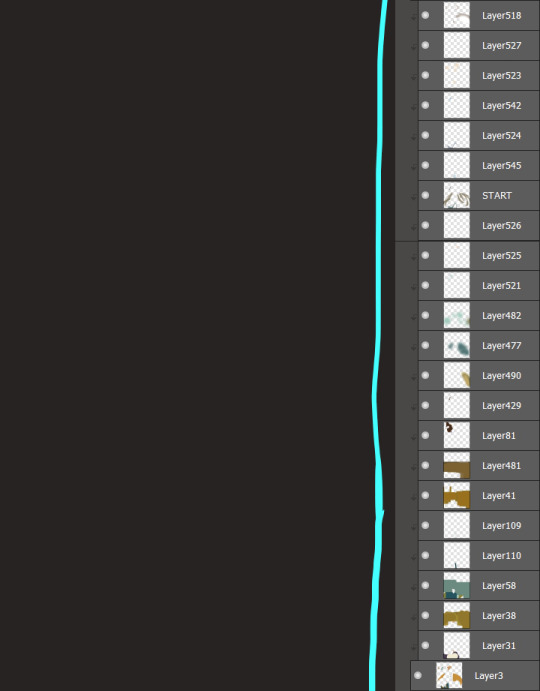
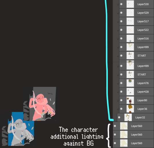
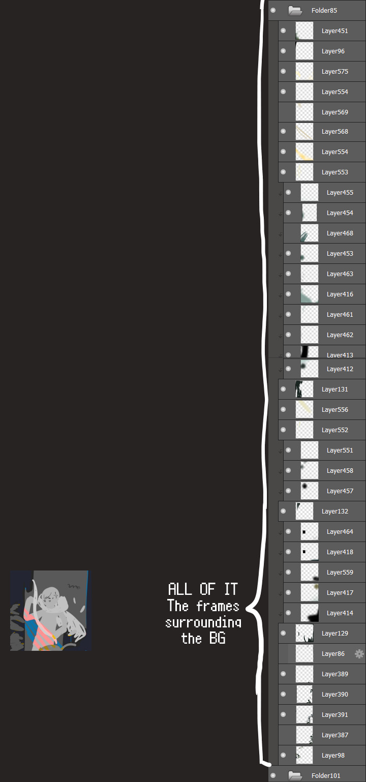
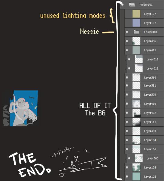
I will now delete my PC's copy because jfc that's one too many MBs ...and it's still eons lighter than what I usually work with on my own full illustrations from sketch to finish......。 (;´༎ຶٹ༎ຶ`) thank you for reading this far and making it out alive, goodbye for now...
・・・ホームページALL LINKS・・・
・Art Gallery・Commission Info・Ko-fi shop・
#art blog#long post#coloring#coloring tutorial#art tips#art tutorial#digital art#digital illustration#digital drawing#digital art tips#digital art tutorials#medibang#drawing journal#drawing process#illustration#coloring practice#nessie#the loch ness monster
24 notes
·
View notes
Note
HELLO, I am here to ask how in THE WORLD do you get a trailer to look so good in gifs? every time I go to do something from a yt video....it always turns up, for lack of a better word, shitty. WHAT ARE YOUR SECRETS besides sheer talent?
aww thank you! but i agree, giffing from youtube videos is THE WORST i try to avoid it, but when WOT trailer season comes around, we have no other choice! in my explanation, i'll only talk about the tools i use, and if you don't have those tools and instead use other tools then i unfortunately won't be able to offer any insight because this is the way i've been making gifs since 2012 haha i am very set in my ways at this point!
my guess is that it might be more to do with the manner of capturing the video than any photoshop settings, because i've found that the quality of the source material is the biggest factor in the quality of a gif. when giffing from youtube (and from all other places), my method is to simply screenrecord the video as it plays in its original player, rather than download a copy of it. this may not be the H-est Q way to do it, but it's good enough for my taste!
i use the free xbox windows app, which has a screenrecording function in it:

then on youtube, i make sure the video is on the highest possible quality setting (so actually clicking on that setting rather than leaving it on the auto-quality default). i right click to loop the video, fullscreen it, start recording my screen, and start playing the video towards the end so that the youtube player will fade away after a few seconds and the video will loop back to the beginning and i can then have a clear screen throughout the whole thing (rather than starting my recording right at the beginning of the video and having the youtube player visible for the first few seconds).
i also suspect that youtube videos miiiiight take a bit of time after uploading to fully process the HD version - for example, i recorded the WOT trailer immediately after it was uploaded, but when i was giffing the next day, i went "wow this shot of nynaeve looks so bad" and went to try to re-record that shot, and sure enough it was noticeably better quality that time. (and i probably should have done the same for the entire trailer, but by that point i'd made a bunch of the other gifs and they were Fine Enough so i couldn't be bothered to redo all of them.) so it might be worth waiting some time after the upload to get your recording, or perhaps letting the whole video play through once to fully buffer as the HD version and then recording the second play? i'm totally just guessing here, who Really knows what caused a quality difference in my two recordings! but if you're screenrecording and notice a low quality shot, it never hurts to at least try to re-record it again and see if it's better that time; internet video players can be finicky in how good the quality is at a given moment.
next i go into photoshop. i've always used the "import video frames to layers" method for giffing, wherein you select that option in photoshop, pull up the video you're using, and highlight the portion of the video you want to turn into a gif, and then photoshop converts it into individual frames for you (i get the sense that the screencapping method is more popular, but it seems so confusing to me, so i've never tried it!)
finally, these are my sharpening settings (using photoshop's "smart sharpen" filter). the one on the left is my usual setting for gifs, which is a more dramatic sharpening, and the one on the right is my milder sharpening settings, which i tend to use for screencaps/still images - i also used these milder settings on my youtube trailer gifset because i found that with the lesser video quality (compared to a gif from an actual episode recorded out of the prime video player), the more dramatic sharpening settings made it look kinda grainy and harsh, so the subtler sharpening ended up being better for those particular gifs.
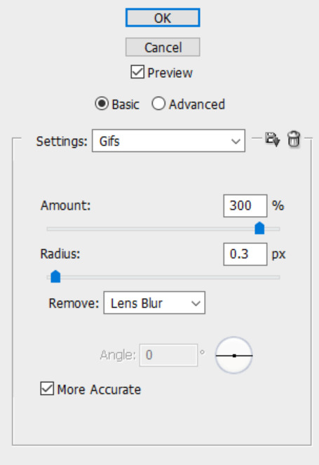
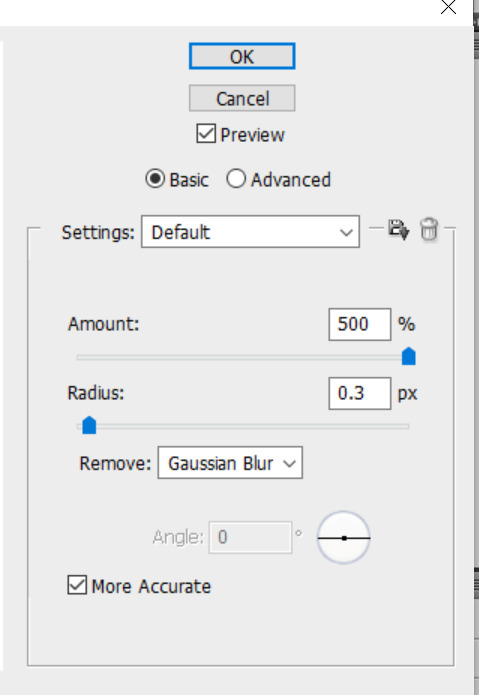
so, that's the basics of my process! like i said, i think the quality of the giffing source is by far the most important factor, and i've found that for youtube videos, screenrecording the HD version straight out of the youtube player works pretty well in maintaining as much of the original quality as possible. you can see here my 2 different recordings of the nynaeve shot. they have the exact same sharpening settings and coloring, but #1 is noticeably blurrier/more pixelated and it's solely because youtube was apparently in a better mood the second time and gave me a better-quality version of that shot for my recording.

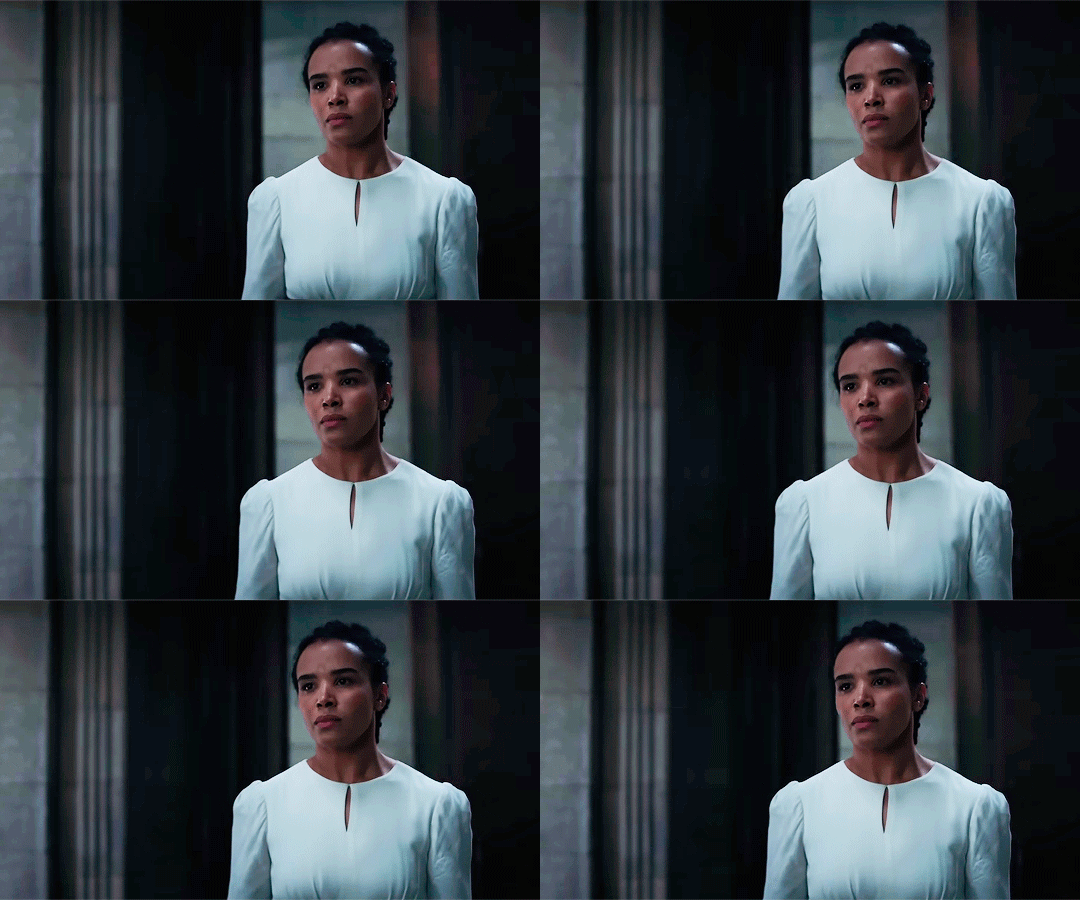
16 notes
·
View notes
Note
What program do you use for your art??? I don’t have a tablet, well I do but it’s not Apple so I don’t have procreate unfortunately, but I use Krita on my desktop sometimes. Any tips on digital art for beginners? Especially with dealing with what to do with layers, what brushes to use, line art, sketching, sketching side profiles (cause I hate doing side profiles), coloring etc. I’m more traditional but I’m trying to get better at digital. Also I love your The Outsiders art—especially the musical Outsiders art you do. And especially your Curtis Brothers art. The Curtis Brothers make my autism go crazy.
Oh shoot that's a lot haha
I use Photoshop now but I've used Krita and IbisPaint before! Tbh I don't have many specific tips for drawing in digital, it's all about learning the possibilities of the program and what works the best for your style <3 Try to check all the brushes you have and if none work for you then download some more :D For layers I mostly make different ones for lineart, skin, hair, clothes and background :) It makes working on the drawing easier! Colouring for me is basically searching for references and using the colour palette from them :D
I struggle with side profiles too :'(( I mostly learned how the shape of the forehead, nose and lips look like and I drew it over and over again until I was able to draw it in one stroke :'))
Thank u sm! Oh yeah I get the hyperfixation on Curtis bros <3 I hope this helps somehow!!!
12 notes
·
View notes
Text
Weekly thoughts! Ep 164.
Yet again there's not much to say about this ep other than reiterating Lyss isn't gonna die.
I have more to say about the behinds the scenes this ep than the actual ep this week. This ep was def a uh... Filler? Episode? That's probably not the word, because it's not like there was irrelevant side plot. But it was very much just written to show characters getting from point A to B. There was an entire deleted scene in this episode where some blank hunters meet them at the bridge and Jay intervenes and escorts them to the meeting place. It was a shame to cut it (especially bc it was gonna be Rex and Jay reuniting), but this was actually the first ep I drew on my new computer after my last one died. I had to get used to an entire new version of Photoshop as well as basically rebuild a ton of assets I lost from scratch. Including that scene was going to add maybe 30 panels to the episode, and honestly I hadn't made any money since my computer died and desperately needed to get some eps in.
So basically, I let myself sacrifice the quality of this one episode for the sake of both budget and just...giving me a break as I got used to an entire new computer and system. I have some other stuff coming up to make up for cutting Jay though! For the like...couple of people who really like him haha.
Btw, thank you once again to everyone who donated or pledged while I was gathering funds for my computer. Ik I always say this series wouldn't be possible w/o you guys, but i REALLY mean it w/ this ep. i can't thank my readers enough for helping me out during that really desperate time.
49 notes
·
View notes
Note
Hey! I’ve been following you for a while and I really love your art, it’s absolutely stunning and I love the way you paint and capture anatomy. I know this is a bit of a broad question but I was wondering if you had any tips on getting better at painting digitally and studying anatomy, maybe more specifically blending, colour picking, and structuring anatomy in a way that looks somewhat realistic?
Thanks and I'm glad you enjoy my work long enough to be following me for this long! I definitely love drawing a naked body that's for sure haha. In terms of tips for getting better there's a few things I can mention but it's going to fall broadly in the general answer of "study", because this is the most sure fire way to be able to understand what it is you're trying to emulate in your art. There are different ways to study, and they teach something slightly different. For example, doing studies from life (live drawing classes) help me understand movement in a way studying from a photograph cant, simply because you're seeing the same model in different poses in real time, you can see how the fat and muscle moves around as they shift to different positions. So they're not technically moving the whole time, but you're still seeing some movement there, and understanding what sticks to what while it rotates and bends. Studying from photographs can help give you time to do some real deep dives and investigate where different bones/muscles sit while someone is in a particular position. There's also the opportunity for understanding how shadows may be formed by the body as typically photographers are more conscious of how the subject may be lit than what may be available in a live drawing class. Beware though, as more things are photoshopped than you realise, not all photos represent reality. Especially glam and fashion photos. It doesn't mean its bad to want to have these effects on your work but just be conscious they might not always be anatomy accurate if that's what you're striving for. I sometimes make a conscious decision to go against what is anatomically correct for a certain effect myself. A book I have been recommending for years for anatomy is Dr. Paul RIcher's "Artistic Anatomy". It's great for understanding muscle structure intimately - it's designed specifically for artists, but with the idea of trying to stylise the diagrams as little as possible for the sake of understanding the human form. There's a lot of great info and detail in here, but beware, there is not a lot of variety in body structure (at least not in the edition I have which is missing female anatomy I think already so I'm not sure what else I don't have in here). So you'll be able to understand function a lot from here but you wont be able to learn a lot about fatter body types sadly.
Colour picking is probably the most difficult for me to explain easily, as I have spent a long time winging it, then studying it, then being really experimental with it. I could write a lot a lot about this but to spare making this post any longer I'll refer to another fun book just for getting started on some frequent and common terms called "Color and Light" by James Gurney.
I also love that he uses like, dinosaurs for everything in here lol. It's a great starting point that can give you some go to ideas that you can then experiment from there. It's not very authoritarian (or at least that's what I feel), and doesn't push anything forward as a hard and fast rule, just showing what affects some colour combinations might instil in someone.
As a whole, I've gotten better at painting digitally by studying traditional painting techniques. They theories are basically transferrable one to one with some few exceptions. I tend to blend my colours by simply using a soft round brush in Photoshop with a low opacity. Much the same way I would with a real canvas, with a large round brush and diluted colour. I hope this answers your questions in some way. I tried to be not too specific only because this answer would be at least another 30k words lol because this is something i think a lot about! I love technique! If I ever stream again, feel free to pop in and ask more questions where I might be able to show some stuff in real time! Not sure when that will happen though!
Also the way i do stuff isn't a "correct" way either. I like painting from imagination so this is how I make that work. Some people like to only work with references for every piece, and that is a completely legit way to create stunning art as well. Good luck!
73 notes
·
View notes
Text
KIMI'S FAQs

INTRO
hi ♡ i'm kimi
gemini ,, filipina

Q&A
what app do you use for your social media fics?
for my smau fics, i use the app social dummy. i've been using the app for almost 3 years now and it comes with formats for twt, insta, lock screen, facetime, imsg, youtube, news, etc. i've made a few one-time payments for the app to unlock specific features like unlimited msging and profiles.
for more recent social media features like insta dm's "replied to your story" formats, i use my own insta accounts and photoshop them into my msg edits. for the most part, i am using picsart, pinterst, or make-shifting the edits on my own.
with all that being said, i have been told that social dummy is no longer available on the app store. there are a few alternatives i've been looking into but ultimately have not been satisfied with the way the edits turn out. i will update this faq if and when i find something new and available for all.
what's your update schedule?
currently, i’m living the kdrama life of the poor full-time student girl with with 2 jobs. as much as i want to commit to updating on a regular schedule,, i can not. my work is usually a tba kind of vibe lol. for the most part, i update when i can and when i want.
what is your content style? what is the kimiverse?
a lot of my fics follow simple storylines imo. i think i end up writing a lot of college/uni au's because that's where my current state in life is so it's a lot easier to relate and gain fic inspo.
kimiverse sums up my fics & characters . it’s more known for the connection between fics like your universe & nonsense ,, casual & sour candy kisses ,, and paraluman & chaebol!jk
my fics are heavily influenced by ariana grande songs and tiktok edits lol
why do you content dump?
haha.
i go through impulsive moments of jus wanting to update. it usually happens when i'm avoiding school work.
how do i get added/removed to your permanent taglist? fic taglist?
to be added to my taglist you can fill out this form.
the alternative is to turn on my notifications!
what are your favourite fics?
my all time favourite fics are linked here.
@kiimirecs is my fic rec page where i reblog my current reads or my reading list.
why is your anon off?
anon is off so i can keep my blog as lighthearted as possible. i had it on for a while now but after a few asks that made me feel meh, i figured this is the best way to set my boundaries. let’s keep the asks kind!
which order am i supposed to read the series if there are extras with the chapter numbers?
read the series parts first. the extras can be read after. i usually put a note in the beginning of the extras to state the time placement for the fic.
why are there so many typos?
it is what it is!
as much as i’d love to edit my work into perfection, i can’t. after i post a texting au, i’d recommend waiting 15 mins because i’m usually doing last minute edits. after i post a written, i’d recommend waiting 1 day because i’m usually re-read it again and again and again and making tweaks. no matter how much i reread or re-edit, i’m always going to be finding little things to change. so, for my own peace of mind.. i give myself the 15 mins or the 1 day before letting it be what it is.
can i critique your work?
no thank you.
i write because i like to write. i write and post content that serves my creative drive and growth as a content creator. i love positive feedback and getting to hear your opinions on characters, but i’d simply like to have my work remain as it is. i worked hard and spent time writing / making the content so jus enjoy it!
i’ll fix my grammar, my wordy sentance, and mis-punctuation when i get paid for writing fanfics… which will be ???
this is art! … and it’s literally fiction.
my main thing has and will always be to write something that makes people feel. if i’ve done that and you’d like to express it kindly, i await your words!

NOTE
— minors are denied from all of my content !
— i do not allow reposts, revisions, or translations of my work on any other platform or any other account ! if my work is being posted elsewhere, please let me know ><
— requests are closed !
— consider sending an ask / interaction for more updates and consistent activity !

© 2024 muniimyg on tumblr
16 notes
·
View notes